Composition refers to the layout of a design, it is an important element in creating an interesting and dynamic piece of work. Composition is a vital aspect of design when ensuring the audience’s eye is drawn to the message of the work. According to Kadry (2017:1) composition “should establish a visual hierarchy that directs the viewer’s eyes through a deliberate visual sequence”.
This blog post will look at a good and poor example of how composition is used in the design of crochet book covers and analyse an improved redesign of the poor example.
Good example
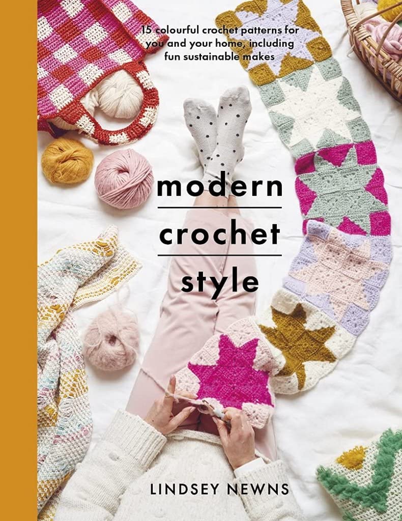
The composition of the Modern Crochet Style book cover tells a story. The title of the book stands out immediately due to it being bold, black font on top of a light-coloured background, in addition to this the fact that the title is central is another reason that the reader’s eyes are drawn to it. The crochet items are displayed in a way that shows the movement of the crochet process, the scarf on the right side leads the reader from the main heading up the page to the sub-heading.
The author’s name is placed directly on top of the body of the person crocheting which possibly is ‘Lindsey Newns’ herself.

Through the composition guideline created from the modern crochet style book cover (please see left) you can see the crocheted items in colours and the negative space of the book cover in white. There is white space around both headings, shown in black and the scarf, shown in grey, looks like a pathway for your eyes to follow.
Landa (2021) makes the point that composition affects the amount of time a person will spend looking at a design, and through the regularity or irregularity of negative space in a design, a rhythm is established when the eyes are looking over a design.
Poor example
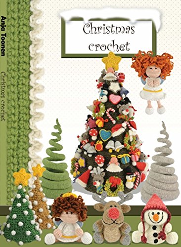
When looking at the book Christmas Crochet the design looks overcrowded and overworked. There is no reason for the crocheted items to be where they are on the page. Whilst Lindsay Newns’ book cover (good example) contains multiple crocheted products, they were composed cleanly and coherently, on the poor example, the crocheted items appear to have been cut and pasted into random spaces with no thought as to why.
The designer has included an image of crochet as part of the background, plus some block colours, plus a white background with grey dots, demonstrating that too many ideas have been combined into one.
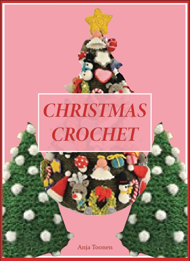
On the revised version of the Christmas Crochet book cover, the heading is central to ensure that the reader’s eyes are drawn to this first. The viewer’s eyes should then look at the Christmas trees which are on a contrasting background colour of pink.
The majority of the crocheted items were removed on the revised design, this was due to a lot of them being included in the main image of the Christmas tree and to simplify the composition. The three Christmas trees are placed in a ‘V’ shape, often in crochet patterns the instructions are to work into the ‘V’, meaning the decision was made to replicate a crochet stitch.
This redesign was difficult due to the poor example being very clustered and the images used were of poor quality, however, the composition of the redesign does stand out in comparison to the original.
References
Kadry, A. (2017) The role of composition in advertising design. Journal of Applied Arts & Science, 1-20.
Landa, R. (2021) Advertising by design: generating and designing creative ideas across media. New Jersey: Wiley.
Newns, L. (2021) Modern crochet style. Barnsley: White Owl.
Toonen, A. (2016) Christmas crochet. City published N/A: Publisher N/A.