The use of colour is important within design, it both draws the eye of the target audience and assists the audience in processing information.
This blog post will be exploring the use of colour by discussing why a good example of colour used on a crochet book cover works and what makes a poor example bad, it will then adapt the poor example to be improved.
Good example
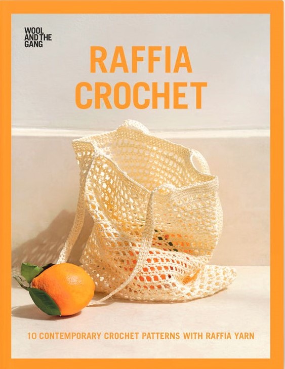
Wool and the gang’s book raffia crochet is a great example of minimalistic colour use. The tones of the colours used on the book cover would stand out to a young target audience and offer thoughts of a summery, warm climate. There is a neutral background with only white and beige being used, giving a very natural, environmental vibe to the design. The contrasting colour is orange to match the physical orange that has fallen out of the crocheted bag, even though this is a bright colour, orange still compliments the neutral tones. Whilst there are only two main colours on the book cover, it pops and would stand out on the shelf.
Colour can convey meanings, affect emotions, and impact purchases of products. When first looking at an item or individual people make opinions and decisions quickly. ChangDa and Bhaumik (2023:1) state that “A product’s or person’s evaluation is based only on colours between 62 and 90% of the time. Thus, a colour is used to distinguish your goods from those of competitors as well as to alter the emotions and moods of specific customers”.
The orange title of the book is placed on the white wall meaning that the title is easily readable, due to it being positive text. In a study by Hall and Hanna (2007:1), they found that “colours with greater contrast ratio generally lead to greater readability” and that “ratings of aesthetic quality were significantly related to intention to purchase.” This confirms that the colours chosen for a book cover directly affects a person’s intention of purchasing a book. This must be considered when starting the design process.
Poor example
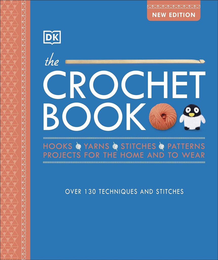
The crochet book is a bad example of the use of colour because it is lifeless. The shades of the colours used on the original version of the crochet book are not complimentary of each other. The salmon pink that is used down the left side and for some of the text is picked from the imagery of the yarn, however, there is the potential to use any colour due to the vast amount of yarn colours available, a different colour would be a better choice.
All text on the original is light colour on a dark background, which is harder to read but the subheading has worse readability due to there not being a great contrast in colours and as discussed earlier this does have an impact on readability.
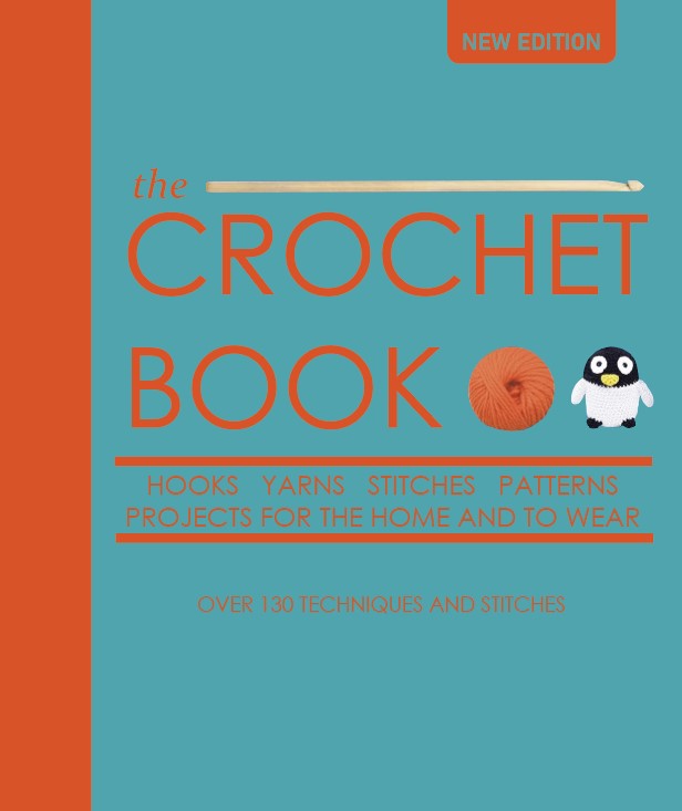
On the revised version the colours are still toned down but have a greater contrast which is more aesthetically pleasing. The chosen colours are opposite each other on the colour wheel, meaning that they are complementary colours. When redesigning the decision was made to have the rusty orange as the text colour on top of the light blue, to ensure the text is easily readable. Overall, the redesign is more striking, and this would hopefully lead to greater sales.
References
ChangDa, H. & Bhaumik, A. (2023) Colour psychology’s impact on marketing, advertising, and promotion. International Journal of Management and Human Science, 7(1), 12-18.
DK (2020) The crochet book. London: DK.
Hall, R. H. & Hanna, P. (2007) The impact of web page text-background colour combinations on readability, retention, aesthetics and behavioural intention. Behaviour and Information Technology, 23(3), 183-195.
Wool and the Gang (2019) Raffia crochet. Exeter: David & Charles.