This post will explain how I incorporated Edward Tufte’s five theories of design into my animation.
Zachry and Thralls (2004) explain that Tufte’s principles advocate for “the creation of graphics that correspond with the mental tasks they are meant to support.” The task of my animation was to educate on the importance of taxing the rich and have a clear call to action, meaning the animation needs to show importance. To complete the aim of educating the audience I made sure to incorporate graphics that support this message.
Colour
Tufte’s principle of colour connects colours to meaning. According to the Interaction Design Foundation (2021) “colour is a powerful tool for evoking emotions, expressing thoughts and communicating”.
To ensure my animation included meaning through the use of colour I considered which colours communicate the key topics money, wealth, unity and hope. Whilst still ensuring colours are used for literal representations, like having the sea as blue.
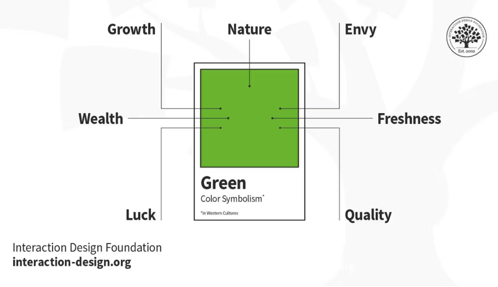
I made use of green colours throughout the animation to represent the subject of money. During the typographical scenes the background colours were different shades of green. This signifies wealth and money, but is also symbol of freshness and growth, to represent the hope for change.
Narratives of Space and Time
A way in which I included Tufte’s theory of narratives of space and time is when storytelling. The animation has a clear beginning, middle and end. The beginning asks a question of the audience, are they experiencing financial hardship? The middle educates them on a possible solution to the hardship, by informing them of what could change in order to help. The end sets out a clear call to action or solution, spread the message to build the movement.
Another way that narratives of space and time was demonstrated within the animation is the speed of the rollercoaster cart. The movement when travelling up is slower and when coming down it speeds up.
Layering and Separation
Ways in which layering and separation were included within the tax the rich animation is through the conceptual transitions. Each scene leads to the next and acts as a layer, e.g. the sweat drips from scene two into the sea in scene 3.
Additionally, layers were used when including multiple hands in the second to last scene, these represent unity among a large and diverse range of people.
Lastly, to add depth through the use of layers I included a lighthouse at the end of a jetty in the distance of the rollercoaster scene.
References
Interaction Design Foundation (2021) What is colour symbolism. https://www.interaction-design.org/literature/topics/color-symbolism?srsltid=AfmBOorj5Q8BwSMllHEko7hh1i968lf5r4g7jf_30CCYQjGpti7AfE3Z[Accessed 5 May 2025].
Zachry, M. & Thralls, C. (2004) An interview with Edward R. Tufte. Technical Communication Quarterly, 13(4), 447-462.