In this blog post I will be evaluating two conceptually designed personal logos that I created using Adobe Illustrator.
First Logo
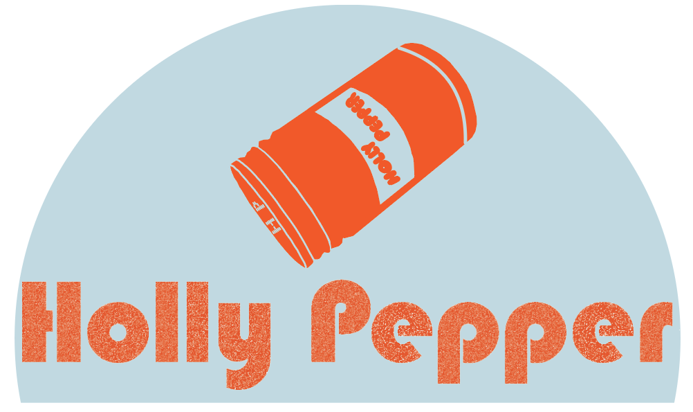
For my first conceptually designed personal logo, I chose to design a pepper shaker. The pepper is being shook to spell my name, Holly Pepper, I chose a grain effect for the font to ensure that the letters look more like pepper granules. The dual meaning to this conceptual logo is that Pepper is my last name, and it is my name that’s being shaken out of the pepper pot. Traditional pepper shakers usually have small holes on top in the shape of the letter P, to further bring my identity to the logo I chose to change these to H P. However, there is an inconsistency to this part of the design, the clean lines to the font do not fully demonstrate the way pepper would be poured. This logo represents my fun and quirky side whilst clearly displaying my name.
Second Logo
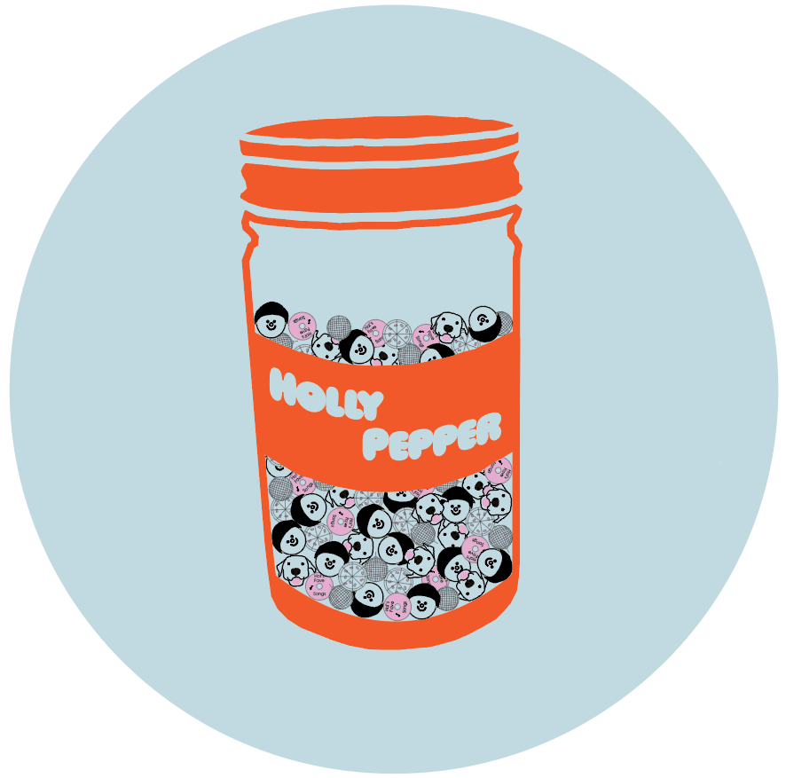
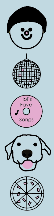
The evolved version of my conceptual logo shows the same pot of (Holly) Pepper, except this version contains pink and black peppercorns; however, they aren’t peppercorns, they are little icons of the things I love and that are most important to me, these are the things that make me Holly Pepper. This includes illustrations I created of my boyfriend, our dog, a disco ball to represent dance, a CD of my favourite songs and pizza, which really represents any food. Please see each illustration that is included to the right. These items are the things that bring me joy and through my designs I would like to bring happiness to others.
I chose colours that I thought popped and have chosen to have pepper shaker label as the darker colour and the name in the lighter colour, whilst studies suggest that positive image polarity is easier to read, Cushman (1986) found that polarity did not affect reading comprehension and speed when reading on screens.
References
Cushman, W. H. (1986) Reading from microfiche, VDT and the printed page: subjective fatigue and performance. Human Factors, 28(1), 63-73.