Development
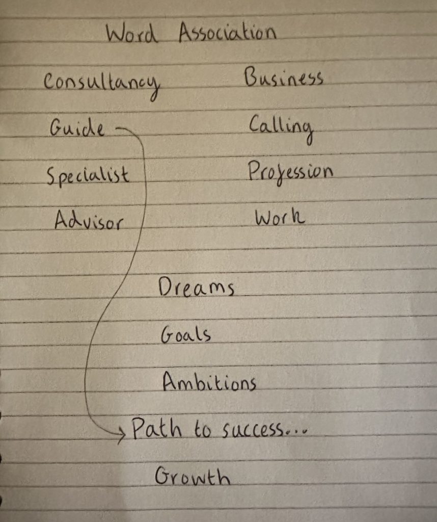
The first phase when creating logo options was to explore words associated with business and consultancy, these lead to the words goals, growth and dreams. With these words in mind, along with the final mood board from the previous post, first drafts of the logo were created.
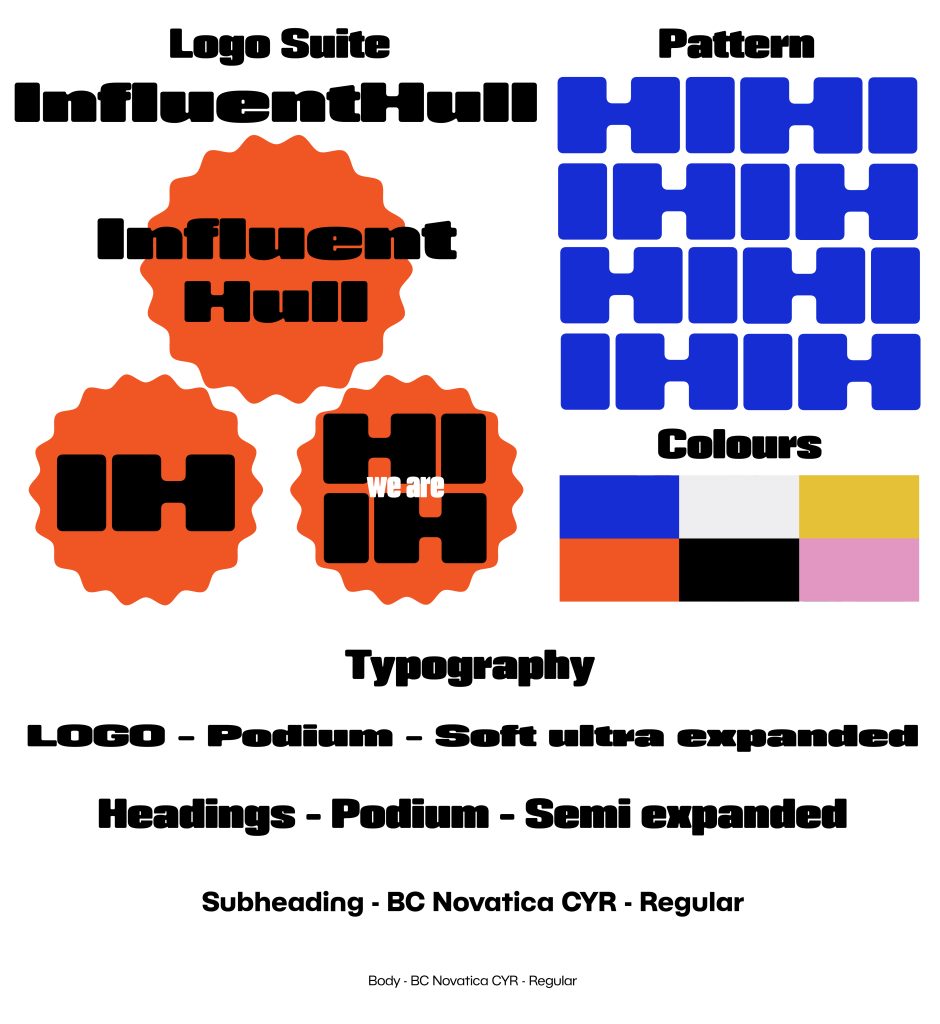
From here the fonts were chosen and developed into the following 3 logo options. All logos were developed without colour to ensure focus is kept on the shaping and design.
Logo 1
This fun, bubbly and cloud like typeface represents your clients achieving their creative business dreams. The curves have a floral affect that connects to the growth that you accommodate your clients to achieve.
Logo 2
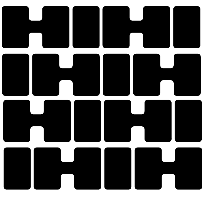
The curved lines in the “N” and “E” illustrate the twist and turns in a business’s journey and the continuation of the “I” in this logo represents the path to success when choosing to work with InfluentHull. The chosen typography is modern and inviting.
Logo 3
This logo is bold, modern and interesting. Whilst bold, the typography has rounded corners leading to a softer feel. The shape in the back connects to the sun rising on a new day with new opportunities. It gives itself to having continued use throughout the branding:
- Photography on the website enveloped within this shape.
- Key phrases or client testimonial being highlighted by the shape.
- A positive light feel throughout the brand identity connected to this shape.
This logo has been further developed:
InfluentHull’s branding and marketing need to showcase their professional standard as their clients are trusting them to help them. This branding page will be used throughout to ensure all content created is connected and recognisable as InfluentHull’s.