In this blog post I will be discussing two typographical name logos I designed using Adobe Illustrator, each logo says something about me.
First Logo

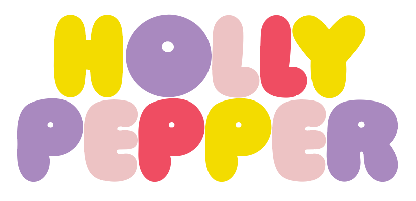
The sans serif font selected for the above typographical name logo is ‘Ziclets Medium’, which is a heavy weight uppercase font that is rounded, bubbly and fun. The kerning for the font was adapted to be closer together and the colours were changed to be bright and bold. By choosing this font the personality traits being communicated are friendly, colourful, energetic, fun, and enthusiastic; the curvy strokes used for this font perfectly represents these. Knight and Glaser (2012) describe the meaning of visual language as text and imagery creating a meaning through its visual appearance. Throughout my life I have been described as a sweet person which is why I was drawn to this font, through its visual appearance viewers are able to understand this meaning.
Second Logo

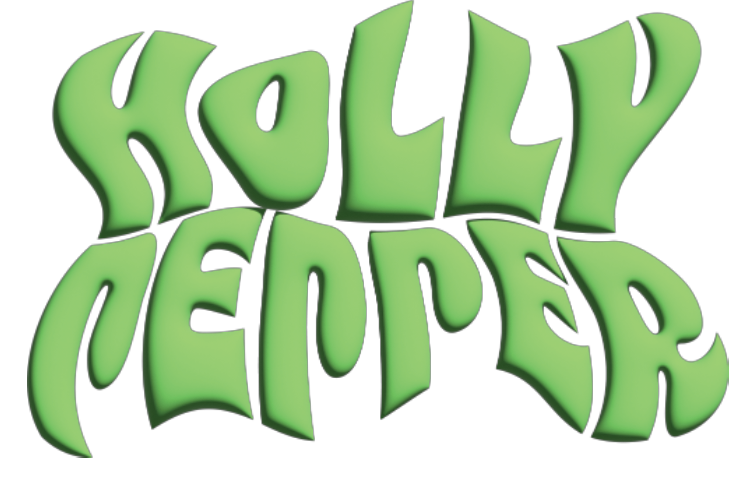
For the second typographical logo I chose the font ‘8 heavy’ because of its 60’s style, I then manipulated the font to make it wavy and 3D, which made it look like the liquid in a lava lamp to again bring in the 60’s feel. When deciding the theme of this typographical logo I wrote down words that describe me and the things I care or worry about, among this list were the following words caring, loving, thoughtful, environmentally conscious, and political climate. I then drew connections from caring, thoughtful, and loving to the summer of love which is a famous social gathering that occurred in 1967. The 60’s was also a time with a myriad of political issues and revolutionary movements against the government in many countries. I feel strongly about the current issues with the political climate and wanted to draw from the 60’s to represent this. To bring in the environmentally conscious aspect I chose for the typography to be green. Being environmentally conscious has been a concern of mine throughout my life and to be able to spread a message about the importance of environmental issues through my future designs is important to me.
References
Knight, C. & Glaser, J. (2012) When typography speaks louder than words. Smashing Magazine, April 2012.