During this post I will be including various wireframes created for TimeBank’s new website. I will be explaining the design choices such as composition and why it will have a positive impact on TimeBank.
For the wireframes I used the mobile first design approach due to the high volume of online users accessing websites through mobile devices, 61.63% based on information from Globalstats Statcounter (2024).
Please see here a link to my Figma Wireframes (videos of these wireframes have been embedded at the bottom of this post).
Homepage
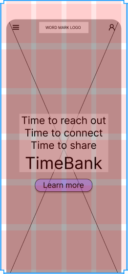
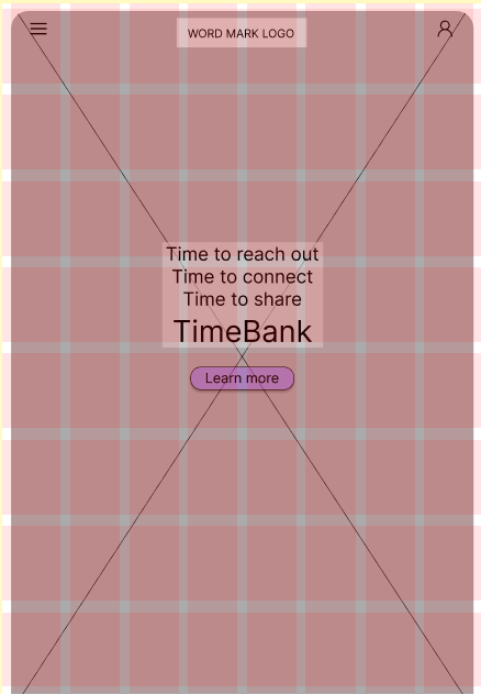
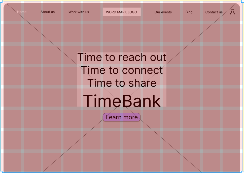
As the homepage is quite often the first page users view it was important to ensure a visual hierarchy was used to prioritise key information first. For this reason, the visual hierarchy of the homepage wireframe for TimeBank is as follows:
- Navigation menu (hamburger style for mobile and tablet), logo and account icon across the top.
- Image of a TimeBank event with clear call to action that would lead to the about us page and an animation across the bottom.
- Illustrations with clickable arrows explaining who Timebank are, how to join, how collaborators and partners can work with TimeBank and how to hire the TimeBank community centre. These points are all the key areas that Kate wanted to highlight for users of the website.
- A scrolling banner that displays different skills TimeBankers have shared.
- A parallax of vector illustrations showing the bigger picture issues that Kate (founder of TimeBank) would like to feature.
- A banner with partners of TimeBanks logos.
- Footer menu including a prompt to subscribe to a newsletter and links to TimeBank’s social media pages.
It is also important to drive action through having clear call to actions. Moving forward when working on the mid/high-fidelity wireframes incorporating prompts directing users to call to actions such as animated illustrative arrows that point towards buttons could make them stand out.
About us
TimeBank’s current ‘about us’ page has a corporate approach of listing their mission and vision in long winded paragraphs which don’t support the human element that they are trying to communicate. TimeBank’s mission and vision should be included through the branding and style of the website and by sharing stories about TimeBank and the community. This is appropriate due to them being a grass roots organisation, it becomes more informal and less corporate. When exploring ‘about us’ pages a common approach was to introduce the founder, then go on to general information about people involved in the organisation.
Events
During the meeting with Kate, she had mentioned having an event calendar on the website. However, this is something they have included in their current website, and it is not populated.
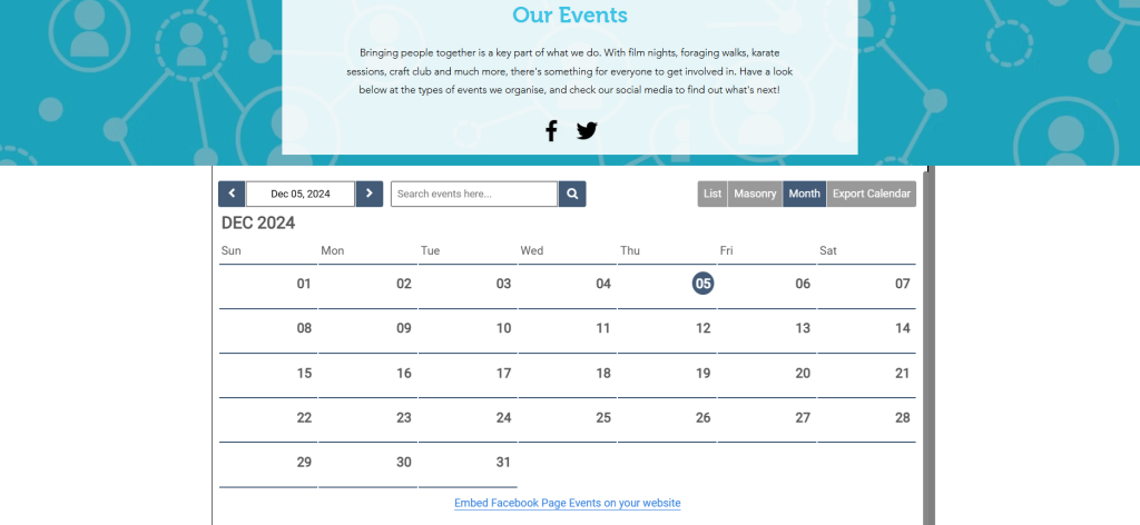
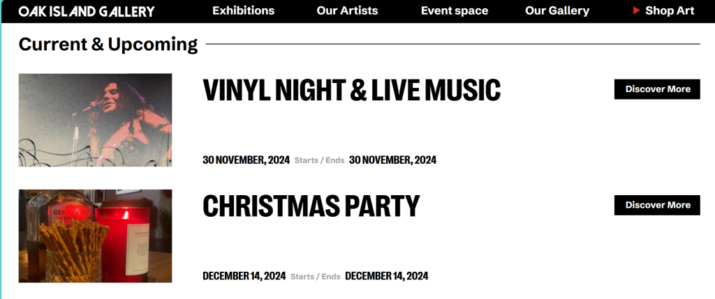
I carried out research in the best choice of ways to display events and based on information from The Events Calendar (2023) photo view is “Best for: Highlighting visual content to entice users to attend your events.” After finding the below page, I concluded that this would be a good way of displaying TimeBank events due to there not being many organised at once. This method also may be less time consuming for Kate to keep updated.
On the mobile and tablet version of the events and join us page I included a chat now/contact us call to action so that users can easily message TimeBank to learn more about specific events or if they felt anxious to attend, they can ask questions first.
Join us
On TimeBank’s current website when clicking on “Sign up” or “Log in” the user is taken to a completely different website, as discussed during the research phase this is confusing for the user. During the meeting with Kate, it was mentioned about creating a new system that is within TimeBank’s website but the practicality of this was not possible for Kate at this moment in time. For the wireframe I encapsulated the other website within a web frame in TimeBank’s website so as not to confuse users. However, a potential option to avoid this may be to have a standard log in/sign up page and within the ‘Thank you for signing up’ email there is a guide on how to log on to the separate system. Moving forward I will create a new ‘join us’ page that is a different approach to having a web frame to assess if there is a better way for TimeBank’s new member to join.
Wireframes
References
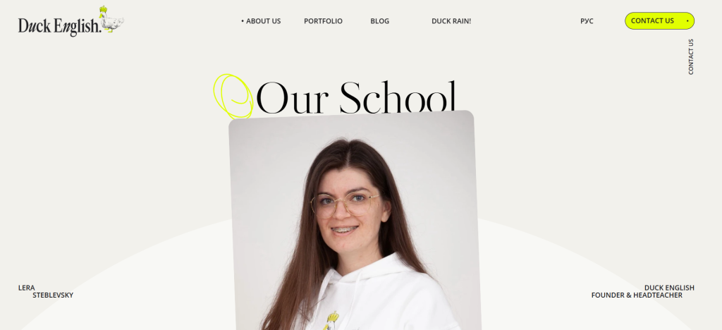
Duck English (2024) Our school. https://duck.school/en/about-us [Accessed 2 December 2024].
Globalstats Statcounter (2024) Desktop vs mobile vs tablet market share worldwide. https://gs.statcounter.com/platform-market-share/desktop-mobile-tablet [Accessed 7 Nov 2024].
Oak Island Gallery (2024). Exhibitions. https://oakislandgallery.com/exhibitions/#current [Accessed 3 December 2024].
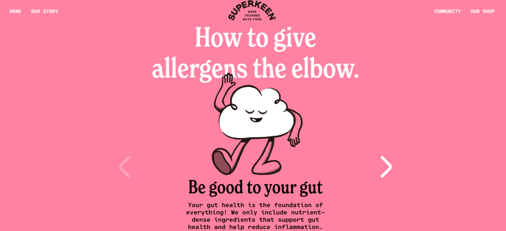
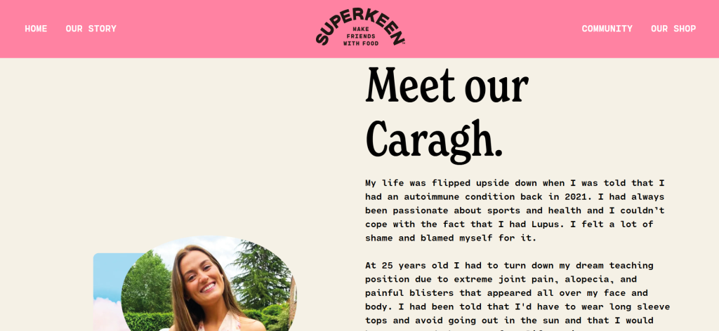
Superkeen Foods (2024) Our story. https://superkeenfoods.com/ [Accessed 2 December 2024].
Superorganism (2024). Homepage. https://www.superorganism.com/ [Accessed 2 December 2024].
The Events Calendar (2021). Best way to display events on your website. https://theeventscalendar.com/blog/learning/best-way-to-display-events-on-your-website/ [Accessed 3 December 2024].