Based on the given case study, the non-profit organisation I would like to “create a multi-channel marketing strategy” for is TimeBank Hull and East Riding. Earlier in this module we were given the task to analyse TimeBank’s website, we discovered that their website had a lot of room for improvement. Additionally, we had the opportunity of meeting the creator of TimeBank Hull and East Riding, Kate MacDonald. She came into the university to discuss the organisations needs for an improved website and digital marketing strategy. Kate’s passion for what TimeBank does for the community and for individuals made me very excited for this assignment.
Introduction to TimeBank Hull and East Riding
In TimeBank’s own words they are “a mechanism to enable people to share skills, knowledge and support across Hull and the East Riding of Yorkshire.”
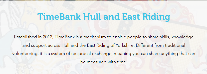
Whilst these statements do explain Timebank, the placing of the introduction and the way TimeBank’s story is told can be improved upon. According to Missouri University of Science and Technology “when viewing a website, it takes users less than two-tenths of a second to form a first impression”. Having an infographic that tells TimeBank’s story would be more beneficial than having a paragraph that takes longer to read.
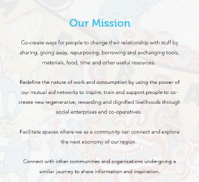
The mission statement is clunky and could lose the users interest and potentially lead to a lack of engagement. Small non-profit organisations like TimeBank can struggle to communicate their narrative in a creative way due to not having time, they are too busy running the organisation.
Through the analysis of the website carried out so far and the research completed on non-profit organisations I have various ideas on how TimeBank’s website and digital marketing can be improved.
Initial Design Ideas
Throughout the module I have been adding websites I found inspiring to a padlet and including comments on composition, typography, style, colour and conceptual design whilst explaining which features and design approaches would be valuable for a non-profit organisation, specifically TimeBank.
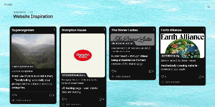
When used correctly these design elements can effortlessly convey a brands messaging in a matter of seconds. Below are the design elements I am considering for TimeBank and why.
Composition
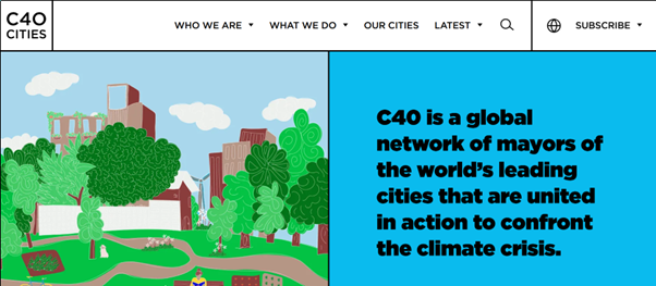
There were various websites within my padlet that had a very interesting composition whilst the overall theme remained corporate. I felt drawn to the composition of the websites that made use of white space, it was easier to process the information within these sites.

I think it would be interesting to tone down the visual noise on TimeBank’s website to create an effective and efficient website.
Typography
Choosing the correct typography is extremely important to conveying the non-profit organisations tone. From our meeting with Kate at TimeBank the words that stood out to me were community, safe, friendly, people, equal, connected. These words all appear in my head as rounded, soft, warm shapes. Below are options that I am looking at for the typography for TimeBank:
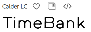
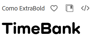
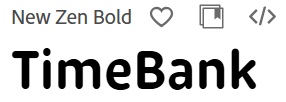
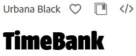
Whilst I have chosen these fonts through Adobe Fonts, sustainability is important to consider when choosing a brands typography as certain fonts such as system fonts use less energy as they don’t need a file to be downloaded to view them. Also, the team at TimeBank may not have access to Adobe meaning that going forward they would not be able to make content that is cohesive to the style.
Style
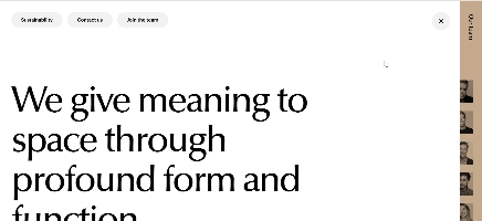
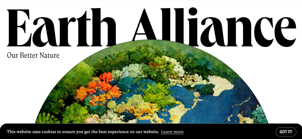
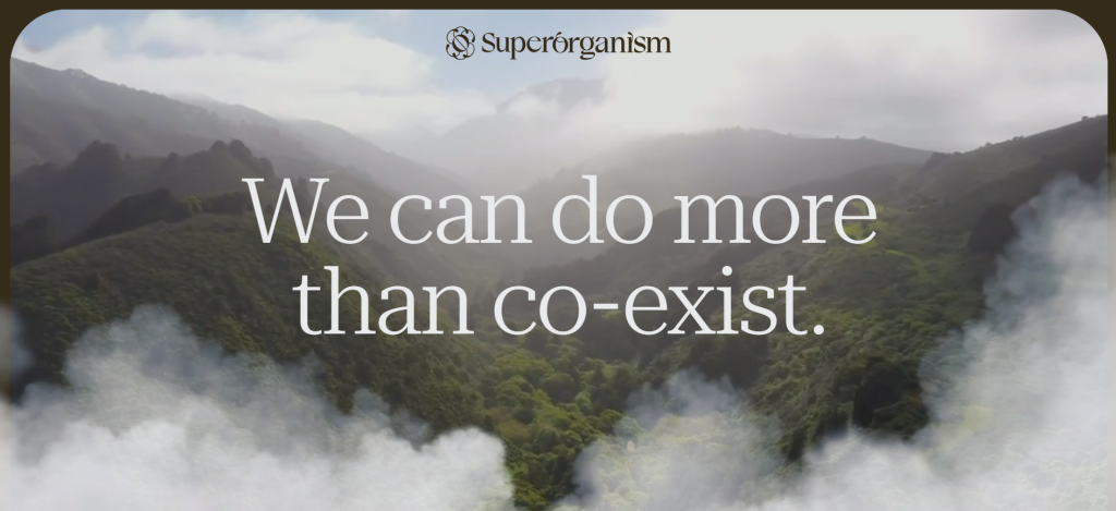
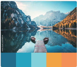
During Kate’s visit I asked her what style she was looking for. Throughout the talk she had mentioned nature and community, this led to us discussing the new look having an earthy, organic style. Please see below a few inspirational websites that encompass an earthy, nature design:
Colour
TimeBank’s current colour palette is a dull blue and brown which are uninviting. Adding warmth to their designs colour palette would be a nice representation of the welcoming warmth of TimeBank’s community. Below are a few colour palettes that may be suitable from the Adobe Colour Library:
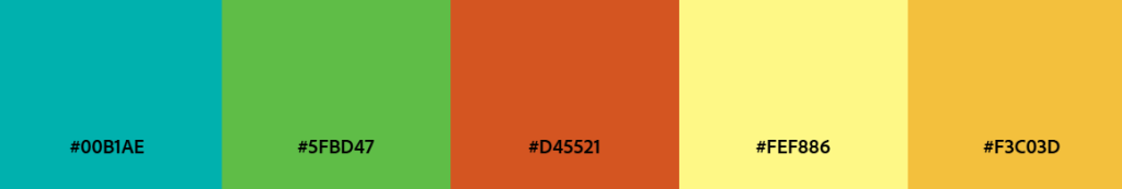
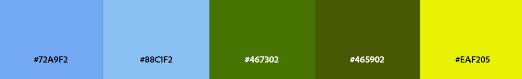
The next steps will be to create a questionnaire to receive feedback on how these colours make the audience feel.
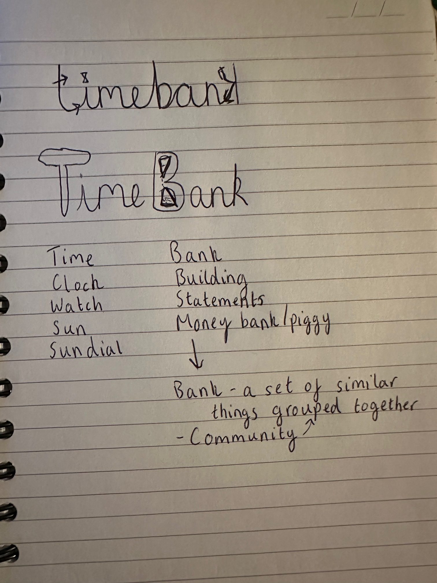
Conceptual Design
Conceptual design is about creating a visual design from an idea and conveying multiple meanings in one simple approach. I have started to create (very) rough sketches for a logo and creating lists of words relating to time and bank.
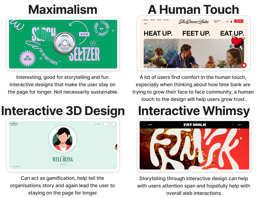
Trends
In addition to the above, I have created a mood board of current web trends based off an article by Anderson (2024) and have linked these back to design approaches that will be useful for non-profit organisations like TimeBank:
Target Audience
Based on the discussion with Kate and the research carried out on TimeBank’s website and social media platforms, the target audience is a wide variety of people. Kate even mentioned that you can’t put it in a box. TimeBank is about connecting with people and being part of a community. It was mentioned that there are currently 900 TimeBankers, there were retired people, people out of employment through disabilities, people who have just moved to the area, professionals, no matter who you are your time is worth the same as everyone else’s.
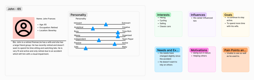
I have created personas and journey maps to understand how a user may go through TimeBank’s current website.
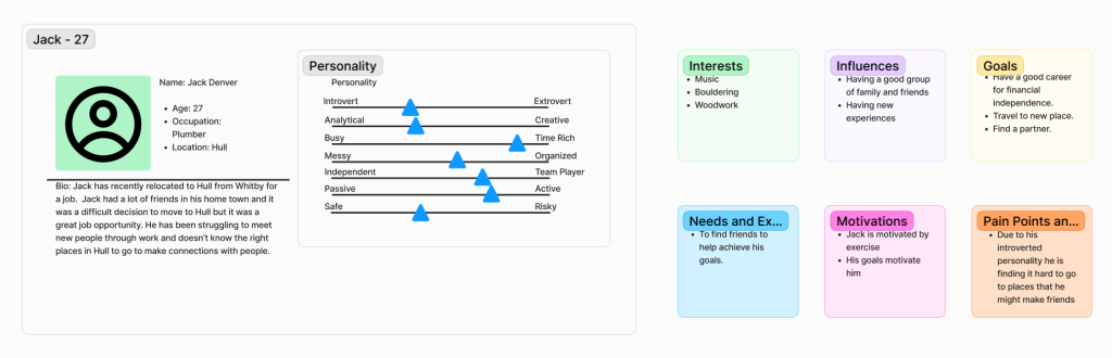
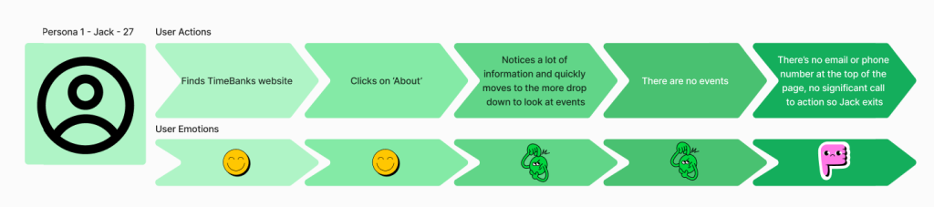
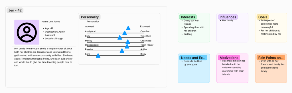
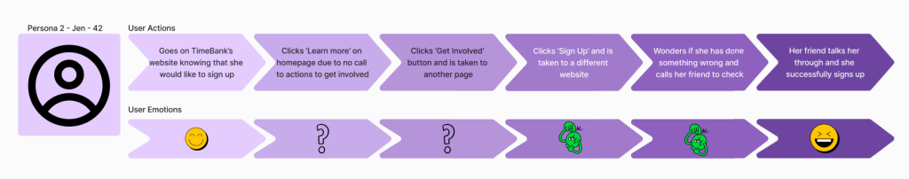
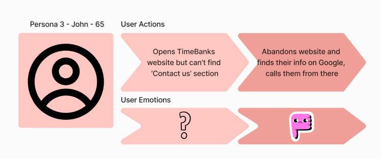
By doing this it has helped me identify some of the pain points of TimeBank’s website and these can be addressed later in the proposal.
Ideas for Multi-Channel Marketing Strategy
When analysing TimeBank’s current website and social media platforms it was noticeable that there isn’t a strategy in place. The social media posts are sporadic, quite often the events are advertised on the day of them (something Kate admitted to during the talk), there is no cohesion to the branding used in them and there are no videos or animated posts. Also, TimeBank post the same content on multiple platforms so are not catering to the target demographics.
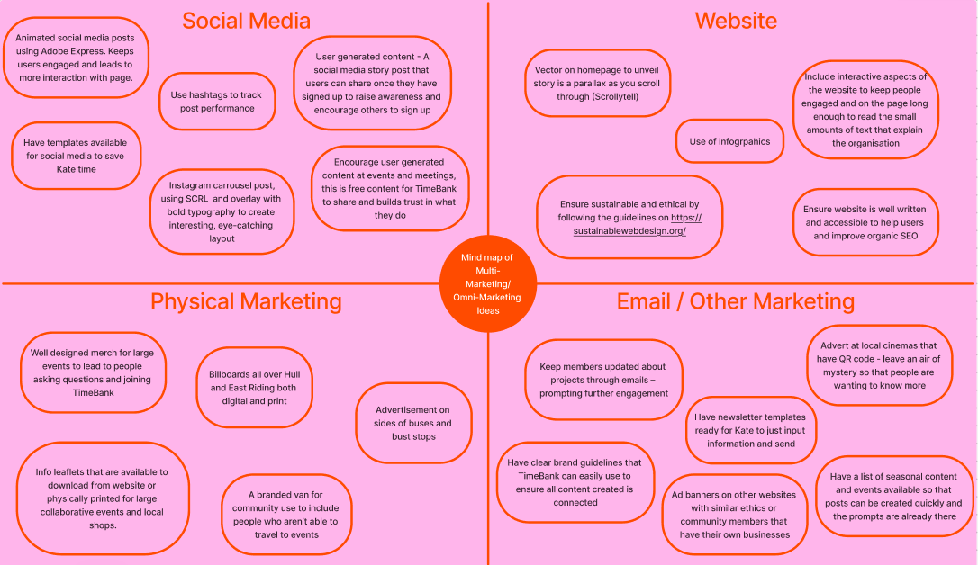
During the meeting Kate showed a YouTube video of an event called the FEASTival that TimeBank held in collaboration with Freedom Festival, the video shows a park full of hundreds of people being fed for free. This video is not on TimeBank’s website. In the background of the video it is notable that there is no branding for TimeBank, this is a huge lost opportunity for omni-channel marketing. Having leaflets on tables, banners and TimeBank t-shirts on the volunteers would help grow the TimeBank community. The YouTube video itself didn’t include any branding or even an explanation to what the event was for. Below is a mind map of objectives for TimeBank’s multi-marketing/omni-marketing strategy
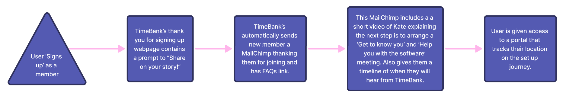
I have also created a workflow for a multi-channel method of a new member signing up to TimeBank:
Functionality and Key Features of New Web Presence
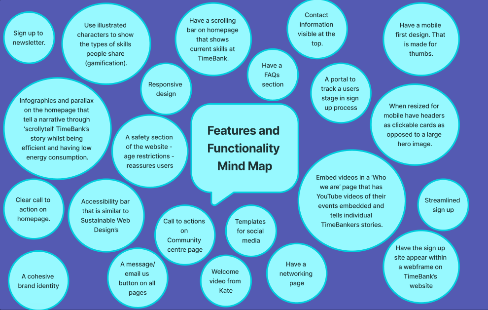
When Kate came in to discuss TimeBank’s needs she mentioned key features that would be beneficial to them. Below is a mind map of the features she would like to see and others that I felt would be beneficial for TimeBank:
Going forward I will be exploring the design ideas and web layouts mentioned within this post and collecting peer feedback to ensure I am making the correct design decisions.
References
Andersen, M. (2024) The biggest, boldest web design trends of 2024—so far [Blog post]. Wix Studio. 14 August. https://www.wix.com/studio/blog/web-design-trends [Accessed 23 Oct 2024].
Careaga, A. (2012) Eye-tracking studies: first impressions form quickly on the web. https://news.mst.edu/2012/02/eye-tracking_studies_show_firs/ [Accessed 8 Nov 2024].
Image References
C40 Cities (2024) Homepage. https://www.c40.org/ [Accessed 8 Nov 2024].
Earth Alliance (2024) Homepage. https://earthalliance.org/ [Accessed 8 Nov 2024].
FAT MILK (2024) Homepage. https://fatmiilk.com/ [Accessed 8 Nov 2024].
Mendo (2024) Homepage. https://mendo.nl/ [Accessed 8 Nov 2024].
Powerhouse Company (2024) About. https://www.powerhouse-company.com/about [Accessed 8 Nov 2024].
Slosh Seltzer (2024) Homepage. https://sloshseltzer.com/ [Accessed 8 Nov 2024].
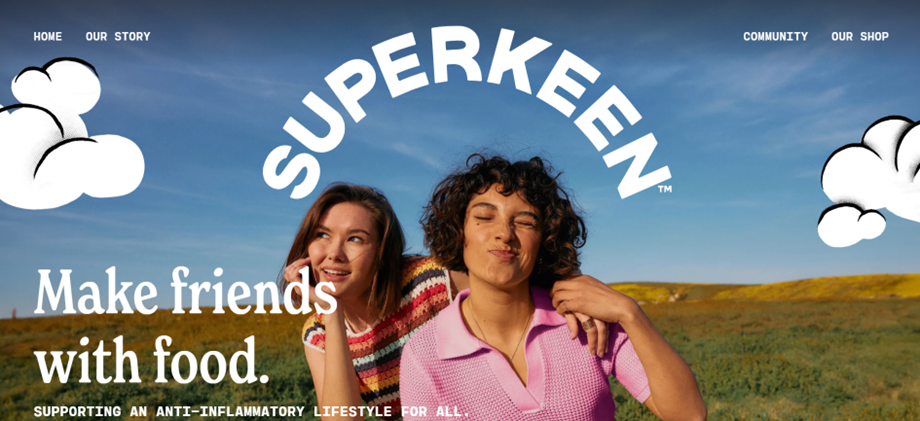
Superkeen Foods (2024) Homepage. https://superkeenfoods.com/ [Accessed 8 Nov 2024].
Superorganism (2024) Homepage. https://www.superorganism.com/ [Accessed 8 Nov 2024].
The Dinner Ladies (2024) Homepage. https://www.dinnerladies.com.au/?srsltid=AfmBOoqVMqKhRVHZsWFGAp0O5cWrtADGQhqPoRfuEwRhynFJilmGq7Vt [Accessed 8 Nov 2024].
TimeBank Hull and East Riding (2024) Homepage. https://www.timebankhullandeastriding.co.uk/ [Accessed 8 Nov 2024].
Unleashing Best (2024) Homepage. https://unleashingbest.com/ [Accessed 8 Nov 2024].