This blog post will follow on from the previous post to further improve on the User Experience (UX) and User Interface (UI) of Leeds Festivals website. These improvements will be made by carrying out primary user research and implementing changes based on the user feedback as well as implementing a few of the design concepts and layout choices discussed within blog posts 3, 4 and 5.
Website design artwork development (developed from research).
Firstly, to ensure a high volume of user feedback, Chinn (2023) suggests that consumers are willing to answer 7-10 questions in a survey. Based on this information a survey was sent out containing 9 close ended questions, close ended questions are the preferred style of question as they create quantitative data which is easier to analyse (SurveyMonkey, n.d.). The first 5 questions and responses can be seen below:
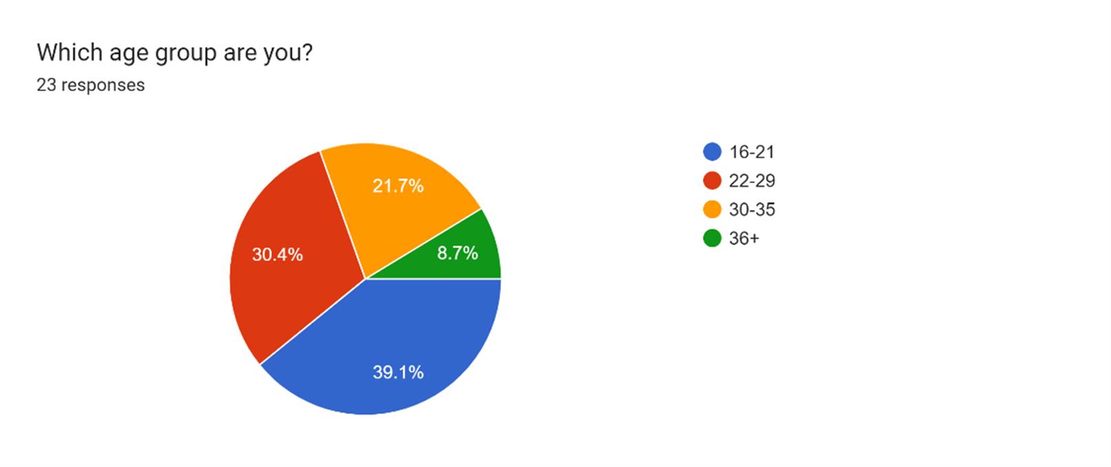
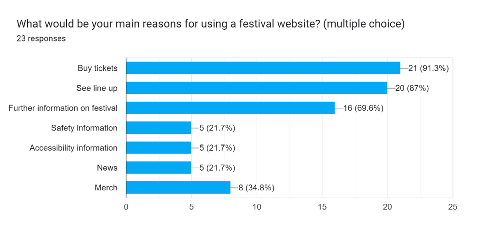
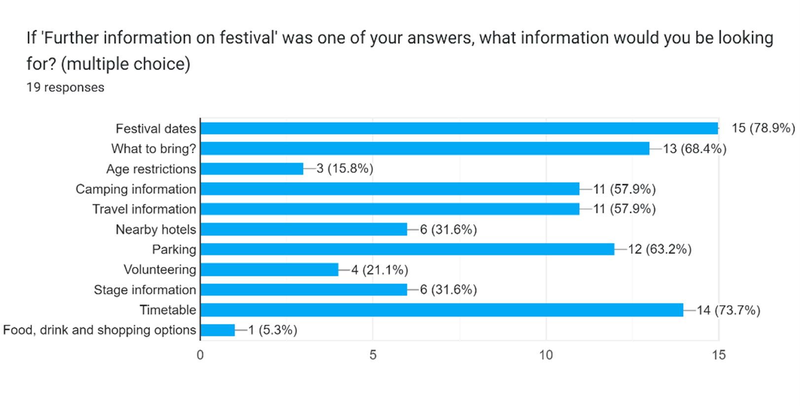
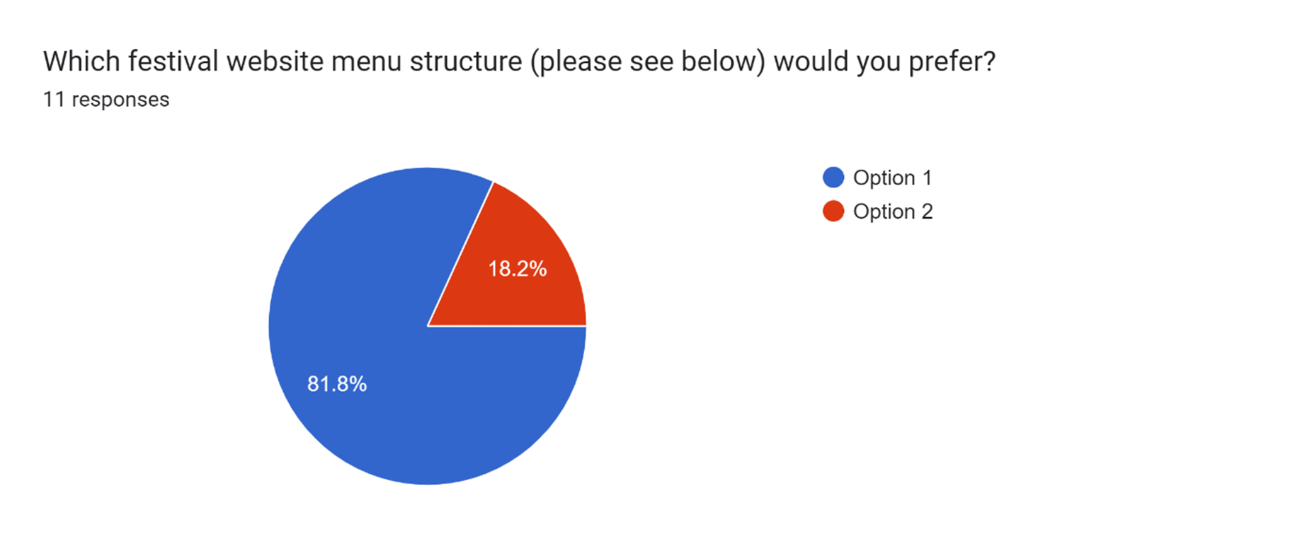
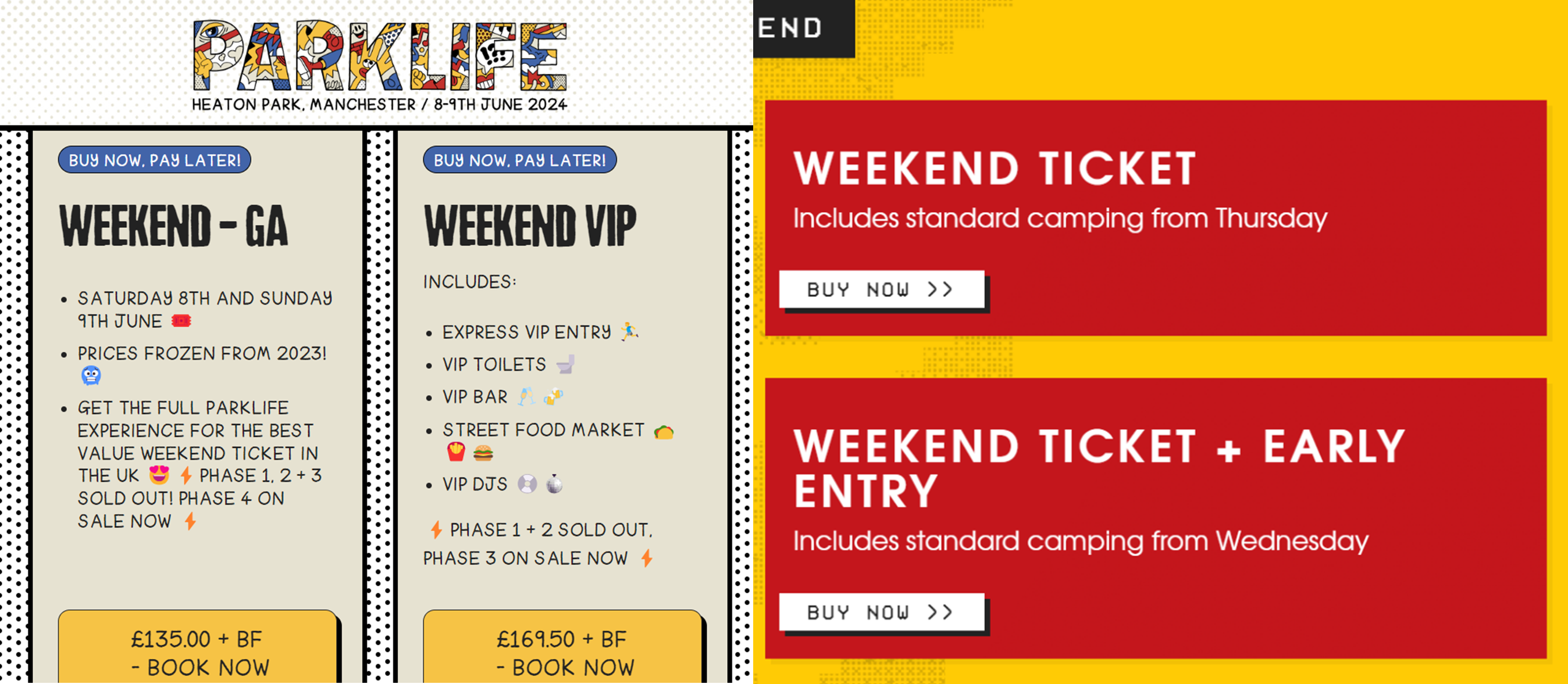
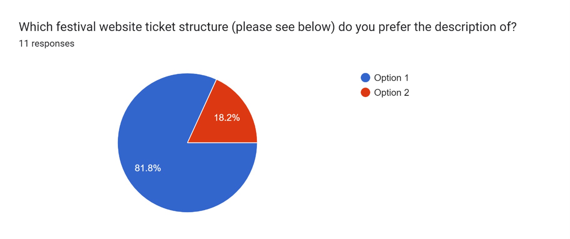
The above responses to the survey confirmed several of the UX design decisions made in the original low-fidelity prototype (in UI & UX Design – Development Research Blog post) were correct, proving that carrying out secondary research can be effective. On the other hand, the responses also lead to a few changes to the previously completed mid-fidelity prototypes. These changes include having less options on the menu bar across the top and including more information on the ticket options page. Please see below the improved mid-fidelity prototypes based on the survey feedback:
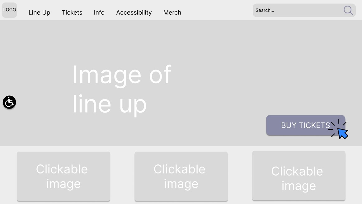
Whilst accessibility was not one of the highest picked options on the survey, for people that would require to view accessibility it would be important to include this on the homepage meaning they are able to easily locate and click on the call to action.
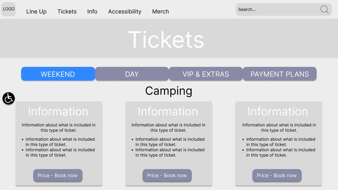
In addition to the changes prompted by the survey feedback, a further change was made to improve the UX. This change was to have clearer visual cues that indicate which selection the user has made on the ticket page.
The next step taken to improve the UX of the website was to focus on the composition of the website pages, to do this a column grid was placed on the previously completed prototype and the layout was adjusted. According to Designlab (2020) column grids helpfully assist designers in creating structured designs that are adaptable for use on a range of screens. Please see below the first three screens that had an adapted layout using the column grids:
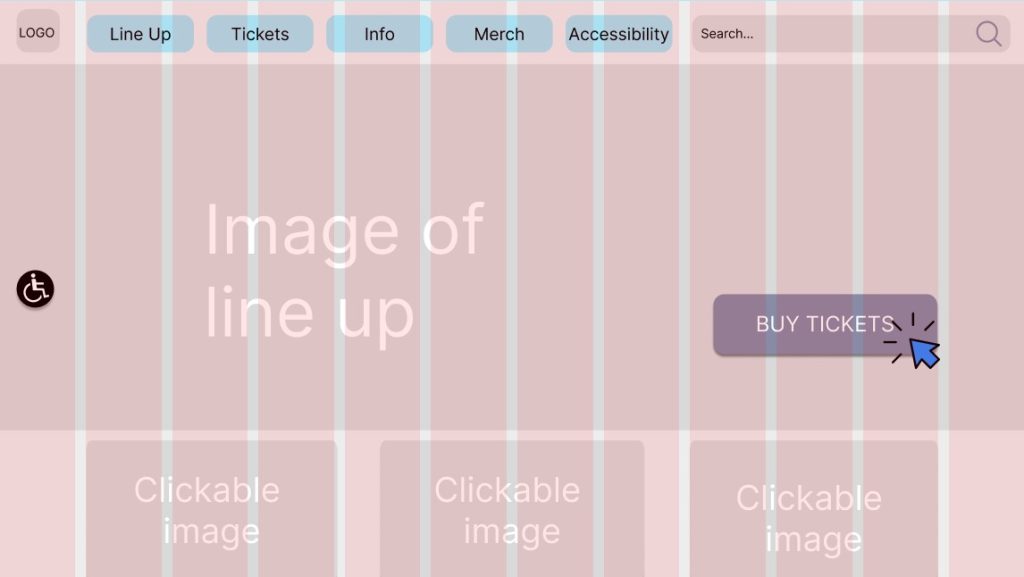
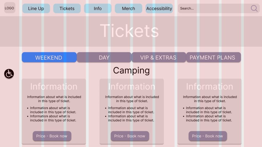
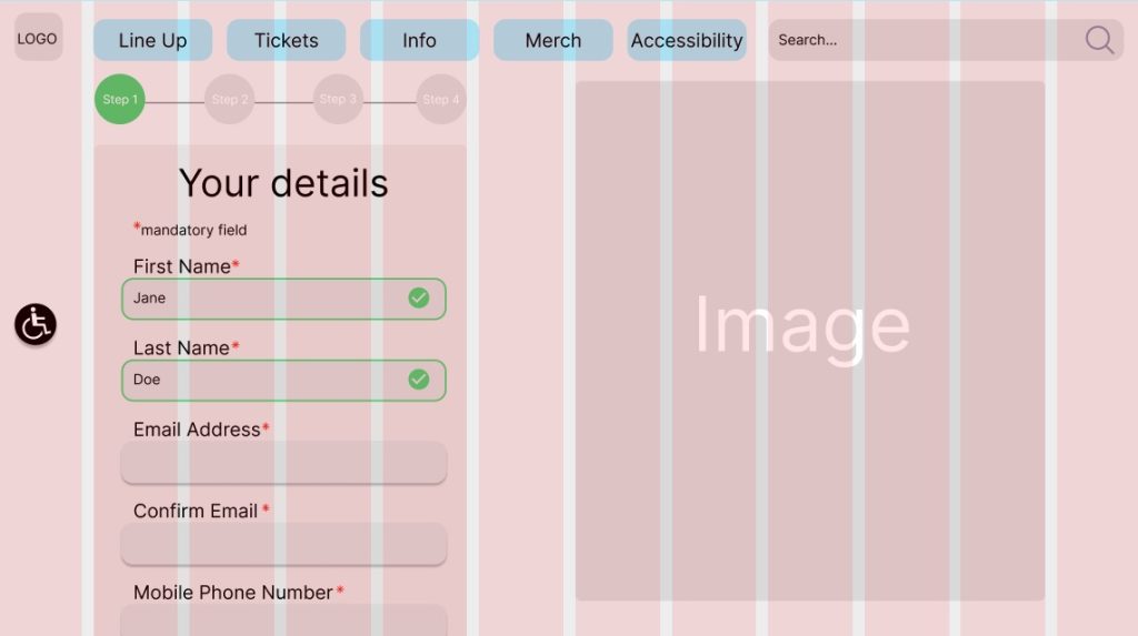
In order to pre-empt creating a responsive design 12 columns were used for the desktop design, this will become part of the 12-8-4 column system. Chemutai (2023) stated that “the 12–8–4 column system is commonly used in responsive web design to ensure that the layout adapts well to different screen sizes.” Responsive layout will be discussed more within ‘Post 5’.
References
Chemutai, P. (2023) 12–8–4 Column system for responsive grids. A beginner’s guide to adaptive design. Available online: https://bootcamp.uxdesign.cc/12-8-4-column-system-for-responsive-grids-df207a58ebc#8805 [Accessed 2/4/2024].
Chinn (2023) How long should a survey be? The ideal survey length [new data]. Available online: https://blog.hubspot.com/service/ideal-survey-length#:~:text=People%20will%20take%20the%20time,you’re%20trying%20to%20accomplish. [Accessed: 15/3/2024].
Designlab (2020) Grids in graphic design: a quick history, and 5 top tips. Available online: https://uxplanet.org/grids-in-graphic-design-a-quick-history-and-5-top-tips-29c8c0650d18 [Accessed 2/4/2024].
Figma (2024) Home page. Available online: https://www.figma.com/ [Accessed 18/3/2024].
Leeds Festival (2024) Tickets. Available online: https://www.leedsfestival.com/tickets/ [Accessed 17/3/2024].
Parklife (2024) Tickets. Available online: https://parklife.uk.com/tickets/ [Accessed 17/3/2024].
SurveyMonkey (n.d.) Best practices for writing good survey and poll questions. Available online: https://uk.surveymonkey.com/mp/writing-survey-questions/ [Accessed: 15/3/2024].
Tramlines (2024) Home page. Available online: https://tramlines.org.uk/ [Accessed 17/3/2024].