To ensure the project is successful it is important to ask for feedback. Feedback can assist in the improvement of a design, the avoidance of errors and give other perspectives. Within this post I will be discussing feedback received and how it was implemented.
The first part of feedback I received was from Kate, the director of TimeBank. This feedback was based on the email I sent to ensure I had understood TimeBank’s problem space. As discussed in Post 1 she confirmed the points should be included and added a couple of extra elements to include. These were to include a collaborator’s/partner’s page and a broader vision page. During the wireframing stage these options were integrated within the design. However, the broader visions were not included as a page within the main menu at the top but built in through the descriptions of who TimeBank are, and the contents of the pages gives the users context of TimeBank’s broader vision.
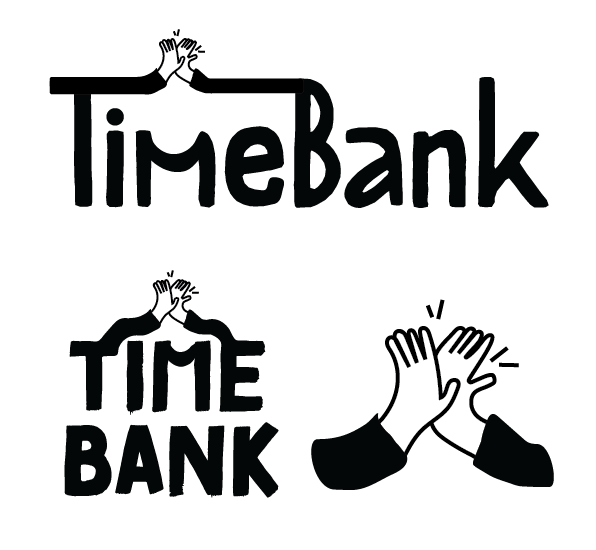
When working on the branding during class time I received feedback from Jason, our lecturer. I had created the primary wordmark logo and the secondary logo. Jason looked at the secondary logo and questioned whether it would be more affective if the arms were connected to the typeface like they were in the primary logo. I followed this feedback, and the logo looked much better for doing so, it also portrayed the connection of the TimeBank community that I was trying to convey in the logo.
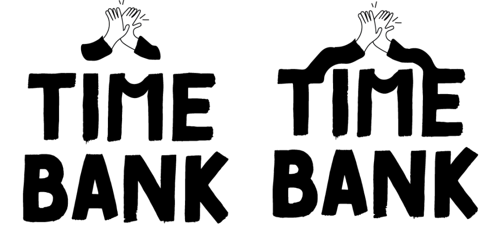
On another occasion when working in class James, another lecturer, looked over the logo suite and we discussed the option of the ‘M’ being the point where the hands meet. However, this would have given a more corporate feel which is not in keeping with the organisation, rather than moving forward with this option I decided to continue with the logo already created.
Once the logo suite was created and colours had been chosen, I sent the below images to my peers for feedback and received the following comments:
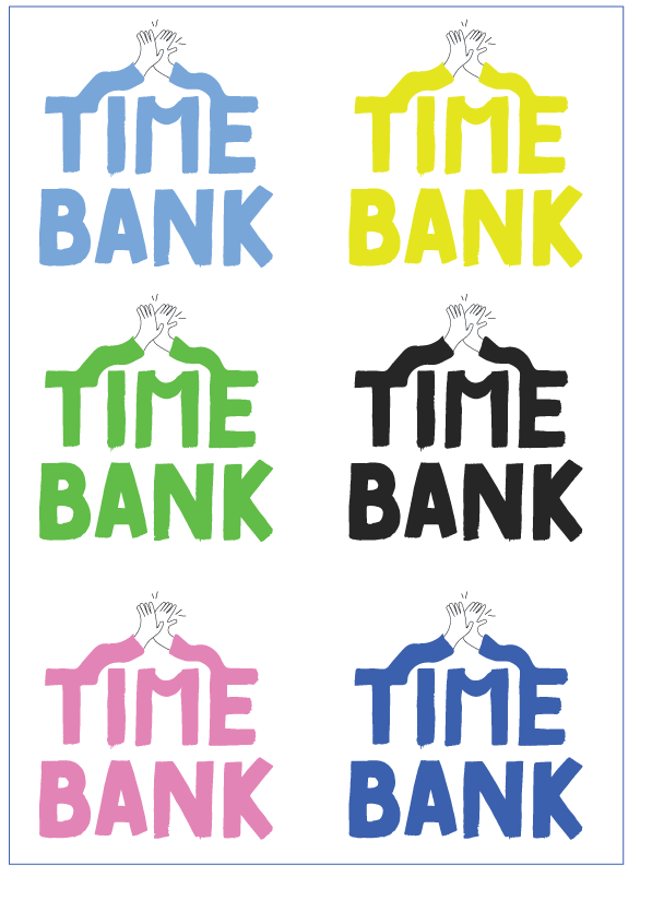
“I love the black ones. The hands meeting is such a good idea.”
“The connection between the T and B is a creative touch, the stylised font is effective, the colour palette is vibrant and cheerful, which matches the theme of TimeBank.”
“I love this logo, I think the style of it is really cool.”
“I love the colour pallete, it makes it feel like different colour shirts on the arms.”
The feedback was very kind and has helped with my confidence of my capability and also knowing that this branding is on the right track and can be included within the high-fidelity prototypes.