For task 2 the brief was to create an infographic that includes three animated interactive buttons. This post will be focusing on the inspiration for the infographic and the learning outcomes.
Initial Idea Creation
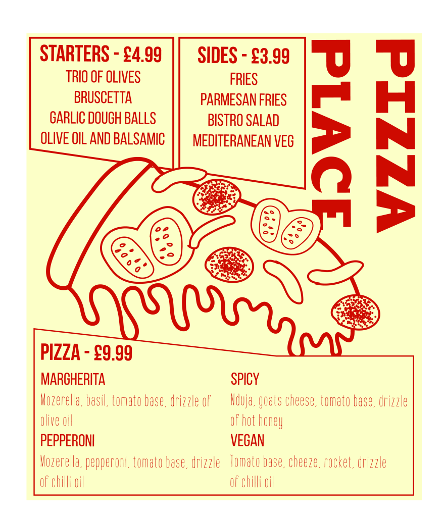
When researching branding for the imaginary venue ‘Pizza Place’ I came across a lovely illustrative style that is ideal for an infographic.
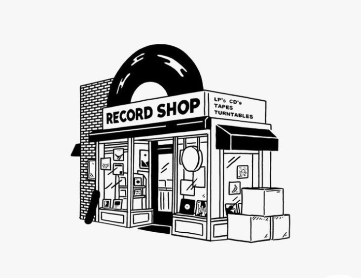
This style of illustration matches the creative, modern and fun brand identity of Pizza Place and connects well with the target audience. The record shop sparked the idea of having half a pizza on the building to stand out from other pizza restaurants in Hull and to communicate with passers by the type of venue.
Plan
My ideas for the animated elements of the infographic were to:
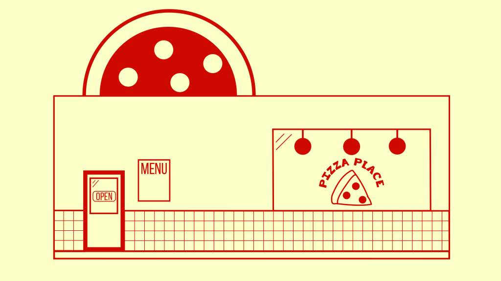
- Click on the menu displayed on the side of the building and the menu pops out.
- Click on the pizza on top of the building and it rotates to reveal information.
- Click on the open sign hanging in the door and the opening hours pop up.
This choice of interaction communicates valuable information to potential customers, when visiting a restaurant website people are likely to be looking for opening times, prices and food options.
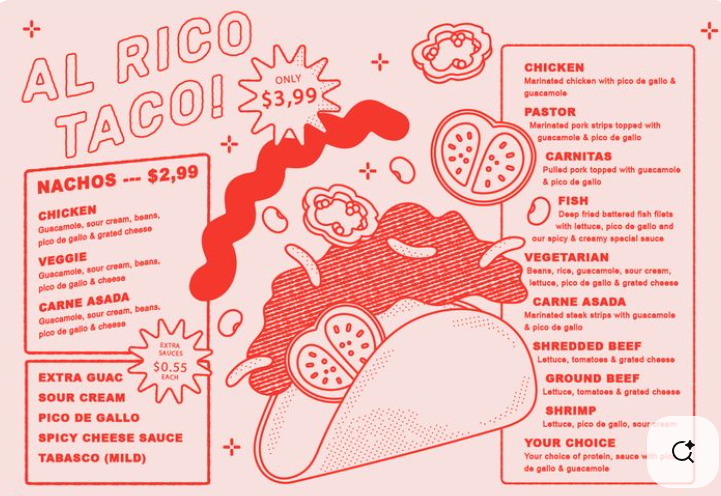
When looking for menu ideas I felt inspired by the below menu, I then created a Pizza Place branded version using Adobe Illustrator and a Wacom Tablet.
Infographic
Please see below the infographic I created using Adobe Photoshop and Adobe Animate.
What I’ve Learned
In completing this task, I learnt how to illustrate using photoshop (something I will be avoiding). I was able to achieve my goal of creating a modern, fun illustration of the exterior of Pizza Place and successfully incorporated interactive buttons that lead to useful information for the target audience. Creating this animation is a task I enjoyed, and I would like to explore this style of illustration and animation in future projects.
A takeaway from this project so far is that task one’s style of animation is very different to task two’s and whilst both animations kept to the brand guidelines I created, they don’t look as cohesive as possible. I prefer the style from this task and think it is more suitable for the target audience. Moving forward to task 3 I will continue with this style.
References
Creative Market (2025) Mexican food menu. https://uk.pinterest.com/pin/68748767707/sent/?invite_code=5820575b059e4ac585b4d6c99d33621f&sender=585116313995717227&sfo=1 [Accessed 12 May 2025].
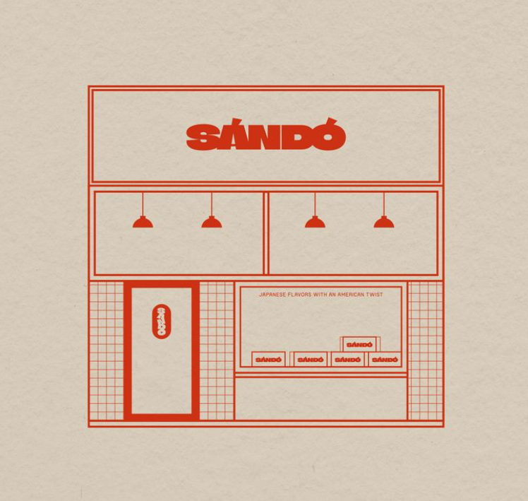
NI Design Studio (2025) Brand design for Sando sandwich. https://uk.pinterest.com/pin/422281211614668/sent/?invite_code=2c0bf929508c4d0294ca65f816aaca83&sender=585116313995717227&sfo=1 [Accessed 7 May 2025].
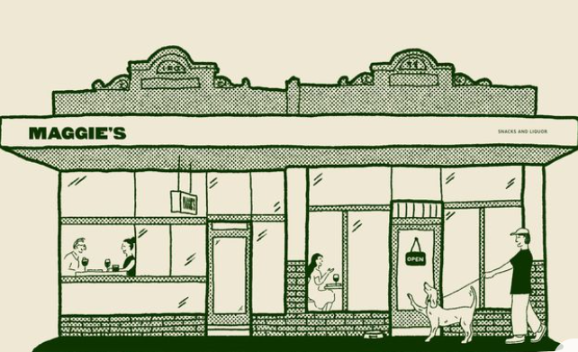
Merrigan, S. (2025) Maggie’s snacks and liquor. https://uk.pinterest.com/pin/36099234507581566/sent/?invite_code=38d06c1a43974d7bb781046d91b3c370&sender=585116313995717227&sfo=1 [Accessed 7 May 2025].
Pinterest (2025) Trippy tattoo designs. https://uk.pinterest.com/pin/13651605111994817/sent/?invite_code=fa5da4cc35764ce7ac7bc6ab9427960d&sender=585116313995717227&sfo=1 [Accessed 7 May 2025].