This post will be focusing on how I will incorporate Edward Tufte’s five theories into my animation.
Edward Tufte’s work promotes the use of graphics and designs that to conveys information concisely, meaning that the audience can understand the information displayed.
During the ideation phase I was brainstorming ideas that were complex and not attainable for a beginner of the software, Maya. When reading Ambrose and Harris’s (2015) Design Thinking for Visual Communication an acronym stood out: “KISS (Keep it short and simple)” (2015:54). I needed to pare back my design ideas to communicate the message to the audience efficiently.
In order to communicate my designs efficiently Edward Tufte’s five theories are going to be included in the following ways.
Use of Colour
Edward Tufte’s theory of colour explains that colour can be used to label, measure, enliven/decorate or imitate reality.
The 3D animation of Stonehenge will use colour as a label in the following ways:
- The grass is green
- Stones are grey
- Cheese is yellow
Additionally, the colours within the animation will imitate reality by using “colour as a representation” of nature. Tufte explores the theory that colours found in nature are familiar to the human eye, meaning that throughout the Stonehenge animation the natural colours I will use to represent the earth’s elements will allow the viewer to process the design more easily. When discussing Eduard Imhof’s principles of colour in ‘Envisioning Information’ Tufte (1990) explains that bright, strong colours are intolerable when covering large areas with no break, however when introducing them to dull background tones they become much more affective. Whilst some of the colours I will be including in my animation will be bright, the stone’s, moon, day sky and night sky will be more muted to allow for the bright colours that will be used to shine.
Small Multiples (encourage comparison)
With Stonehenge being the subject of my animation, the theory of small multiples will be used, for the creation of the rock formation I will be using a reference picture and moulding each stone to replicate the actual Stonehenge. This means that each stone will be different and by using the correct camera shots the viewer will be able to see the differences within one viewpoint.
This theory and the natural formation of Stonehenge can also be linked to Gestalt’s principle of common region. “We perceive elements that are in the same closed region as one group” (Interaction Design Foundation, 2016).
Narratives of Space and Time
An example of how I will include a narrative of space and time is the narrative of the sun going down and the moon coming up to show the passing of time.
Layering and Separation
A form of layering I intend on incorporating in my design is the curtain like clouds mentioned in posts 1 and 2 being the foreground. The moon and sun will be in the background with the stars at different depths. The Stonehenge model will be at the middle ground and the whole scene will hopefully resemble the layers of a theatre stage. The use of these layers will create a depth that will highlight the 3D element of the animation.
Tufte (1990:65) states that “INFORMATION consists of differences that make a difference”. Within the animation I create, the stone will gradually turn to cheese one by one, which will display the differences and allow the audience to compare and understand the information that is being displayed.
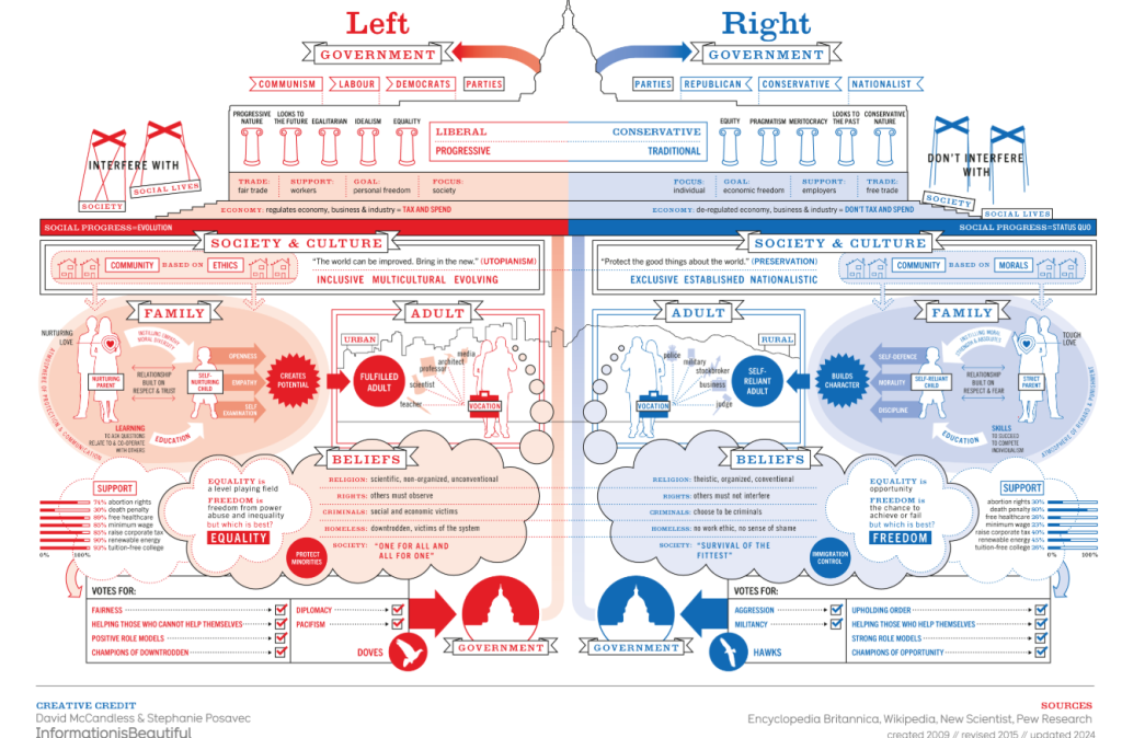
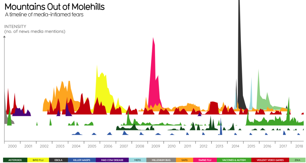
Micro / Macro Readings
This theory does not link to my planned animation. However, I have found an example of data visualised in an interesting way that demonstrates micro and macro readings.
References
Ambrose, G. & Harris, P. (2015) Design thinking for visual communication. Bloomsbury.
Information is Beautiful (2024) Left vs right (world). https://informationisbeautiful.net/visualizations/left-vs-right-world/ [Accessed 12 Mar 2025].
Information is Beautiful (2025) Mountains out of molehills. https://informationisbeautiful.net/visualizations/mountains-out-of-molehills/ [Accessed 11 Mar 2025].
Interaction Design Foundation – IxDF. (2016) What are the Gestalt principles? https://www.interaction-design.org/literature/topics/gestalt-principles [Accessed 11 Mar 2025].
Liron Topaz (2010) This Side Up – A Short Animation by Liron Topaz [Video]. https://www.youtube.com/watch?v=BCC7rFxo6QA&t=4s [Accessed 11 Mar 2025].
Tufte, E. R. (1990) Envisioning information. Graphics Press.