During this post I will be discussing the reasoning behind the design choices made on the homepage and about us page for TimeBank Hull and East Riding.
High-Fidelity Prototype
Here is a link to the Figma Prototypes.
Homepage
For the hero image on the high-fidelity homepage prototype I used imagery of the Humber Bridge, to represent TimeBank’s location of Hull. Moving forward I will contact Kate MacDonald and source imagery of TimeBank’s events to be included as the hero image.
As discussed in post 2, I found inspiration from Superorganisms website and wanted to incorporate an animated element at the bottom of the page. This was done by creating vector images of clouds in Figma and creating a component and frame to frame animation.
When scrolling down the page you reach the illustrated section, initially I was going to illustrate in a similar style to Superkeen’s website.

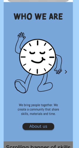
However, I decided that it would be more cohesive to the branding created if the illustrations were all hand related. Which again contributes to the human element of being connected and helping hands.
When writing the small descriptions to accompany the illustrations I ensured plain language was used that is easily understandable for all users. Additionally, strongly contrasting colours were used to ensure good readability. Also, as per Apple’s recommendations for touchscreen devices the hit targets are at least 44x44pt (Apple, 2024).
An animated scrolling text banner has been included on the homepage that displays skills that have been shared between TimeBanker’s, this is useful for new users of the TimeBank website as it communicates the variety of skills being shared and the opportunity that TimeBank gives them to connect with people.
I met a technical challenge when creating an animation of hands in the middle which will be rectified during the next assignment. This was there to symbolise the bigger picture projects that Kate would like to highlight, the work with other organisations that are coming together to reduce waste and act on issues such as climate change. The logos of these partners are included in the banner below this section.
Lastly is the footer which includes a prompt to subscribe to a TimeBank newsletter, TimeBank’s contact information and call to actions that lead to their social media pages. This is part of the multi-marketing strategy, which will be discussed in further detail in the next phase.
About Us
As recommended by Laubheimer (2024) to improve UX I have communicated the user’s current location at the top of the page.
The main image on this page acts as an introduction to Kate MacDonald and below is a small but powerful sentence about TimeBank that will lead the user to wanting to learn more. When continuing to scroll down the user learns a little more about TimeBank through the use of information taken from their current website that has been adapted to be more bitesize and more user friendly.
An animation of flowers growing was created and included to represent TimeBank’s connection with nature and the growth that people involved in TimeBank experiences.
The next step was to include a timeline of TimeBank’s history, this still needs to be populated with information. But I would like for it to take users on a journey that leads them to understand that TimeBank is a place to give your time to others and receive it back from others, that everyones time is worth the same and that everyone has skills to share (the images were taken from TimeBank’s current website).
Lastly, the page includes key moments from TimeBank’s past that demonstrated their work with other organisations.
Next Steps
Within the next phase I will be creating a full set of brand guidelines, social media templates, newsletter templates, automated emails for new members, posting schedules, making the website responsive and mock ups of physical branding items such as merchandise and event banners.
References
Apple (2024) Design developer accessibility. https://developer.apple.com/design/human-interface-guidelines/accessibility [Accessed 5 December 2024].
Laubheimer, P. (2024) Menu-design checklist: 17 UX guidelines. https://www.nngroup.com/articles/menu-design/ [Accessed 5 December 2024].