Within this post I will be analysing current web design approaches such as: responsive designs, accessibility, sustainability and ethics, whilst discussing how these approaches could have a positive impact on non-profit organisations if utilised correctly.
When designing a website, it is important to consider the user’s needs. A non-profit organisations goals may be to receive donations, and it is their responsibility to make this action easy for the user to complete through their website and other platforms. Usability goals should be met, and design approaches can be introduced to improve these goals and the overall user experience (UX).
During the group activities discussed in the previous post, the design approaches of non-profit organisation were analysed and included into the below Padlets:
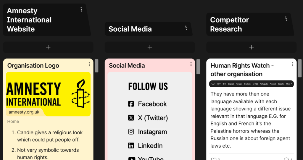
There is a noticeable contrast in the design approaches of a larger non-profits that have more resources available, which possibly include a dedicated design and marketing team, to the smaller non-profits which have limited resources. Below I will compare good and poor examples of some of the key design approaches to consider.
Responsive Design
When executed well, responsive web design means a design will match any screen resolution with optimised usability. Additionally, it is important to adapt the layout to target the correct audience based on the device screen size.
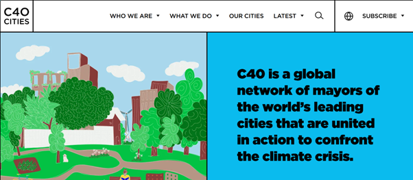
Good Example

These videos demonstrate good responsive design as the homepage layout adapts sensibly in relation to the size of the screen and works well in both portrait and landscape orientation. The user is easily able to navigate the website on a desktop or on a mobile phone.
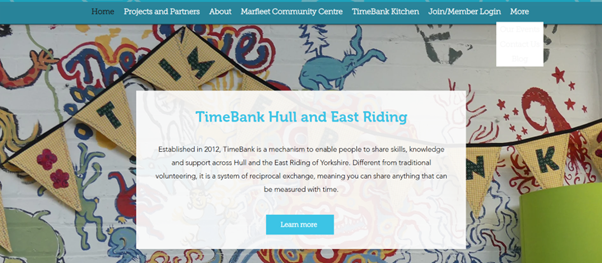
Poor Example

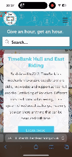
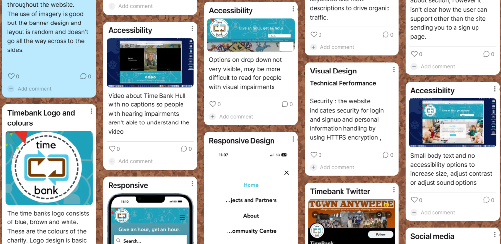
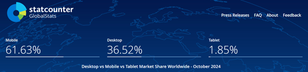
These videos show ineffective responsive design. The first video shows that there is no response when the screen size is adjusted on a desktop, meaning that the main body of text, part of the logo and most of the menu bar disappear off the side of the page. When used on a mobile phone, which 61.63% of users do (Global Stats Statcounter, 2024) the design does fit the screen size, however, when the burger menu is opened the words aren’t fully displayed. This poor example of responsive design could lead to a high bounce rate.
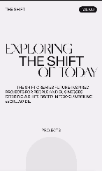
Below is a grid overlay showing the difference in professional standards when a grid system is used to create a responsive website.
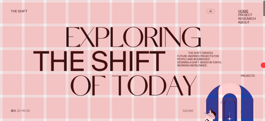
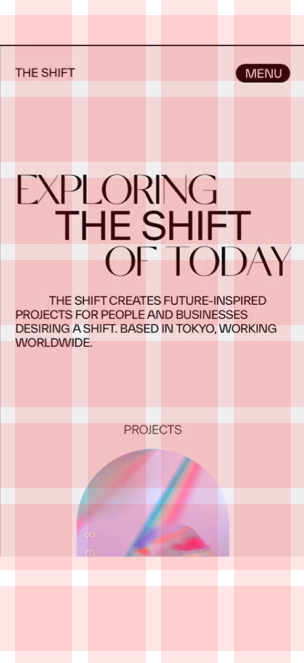
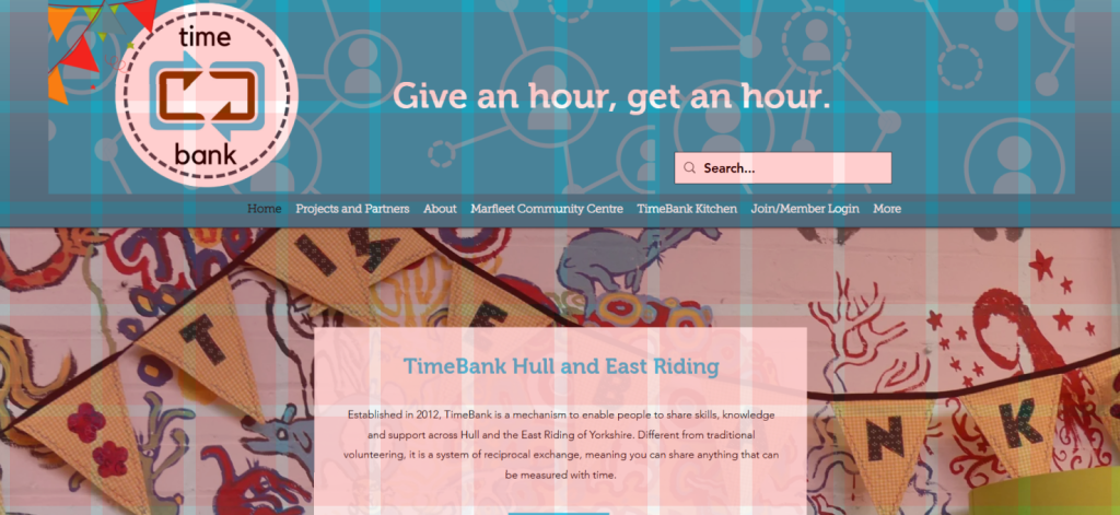
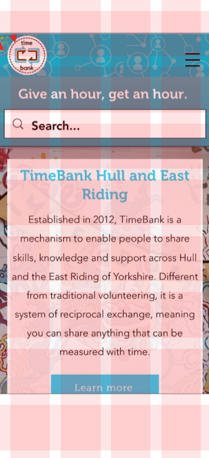
The Shift Tokyo demonstrating how the use of a grid system, white space and having an adjustable layout is key for creating aesthetically pleasing content that includes the necessary information. TimeBank’s website doesn’t seem to have used a grid system, and this may have contributed to the issues in their responsive design.
Accessibility
Accessibility should be considered from the beginning of the design process. According to the World Health Organisation 16% of the world’s population have a significant disability (2023). Ways in which web designs can be accessible are:
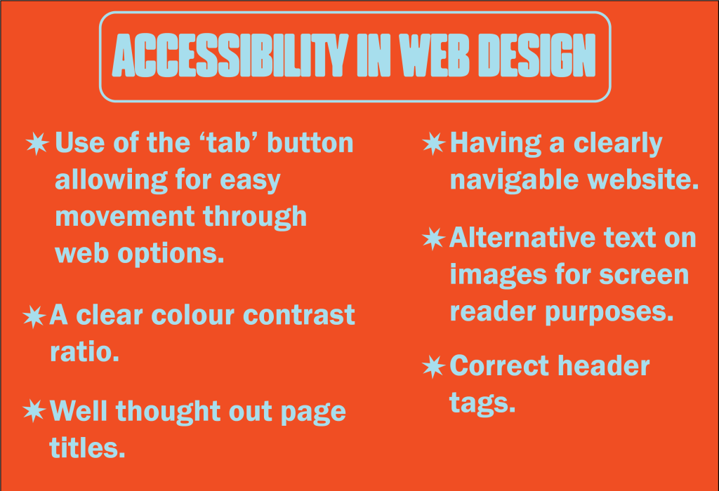
It is important to consider assistive technologies like screen readers when in the design phase, having alternative text for images will not only help users with visual impairments understand a website but can also make the designer include images that are more useful.
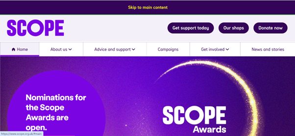
Good Example
Poor Example
Sustainability and Ethics
Ethical and sustainable design means the environment, people, and society as a whole are considered during the design process. Within any industry it is important to consider who a product effects throughout the process, both in the making of and as an outcome of the products sale.
“If the internet was a country, it would be the 4th largest polluter” (Freitag et al., 2021), meaning it is extremely important that designers make a conscious effort to create websites that are more sustainable.
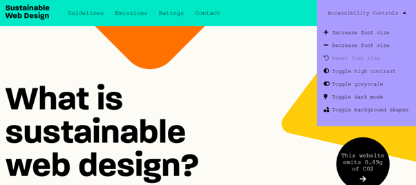
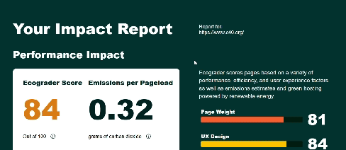
According to Anderson (2024) digital sustainability is a current web design trend. There are websites available to check the eco performance of a website: https://ecograder.com/
I have tested a good example and poor example through Ecograder and here are the results:
Good Example
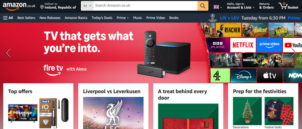
Poor Example
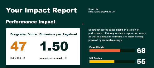
These sustainability checks can assist in web design, by giving pointers on how to improve efficiency. In addition, Sustainable Web Design has a sustainable design manifesto along with guidelines on how to create more sustainable digital designs. https://sustainablewebdesign.org/guidelines/
Reference
Accessibility Checker (2024) 13 Modern accessible website examples to inspire you. https://www.accessibilitychecker.org/blog/accessible-website-examples/ [Accessed 4 Nov 2024].
Amazon (2024) Homepage. https://www.amazon.co.uk/ [Accessed 4 Nov 2024].
Anderson, M. (2024) The biggest, boldest web design trends of 2024—so far. https://www.wix.com/studio/blog/web-design-trends#viewer-hvgca29928 [Accessed 28 Oct 2024].
C40 Cities (2024) Homepage. https://www.c40.org/ [Accessed 4 Nov 2024].
Freitag, C., Berners-Lee, M., Widdicks, K., Kowles, B., Blair, G.S. & Friday, A. (2021) The real climate and transformative impact of ICT: A critique of estimates, trends, and regulations. Science Direct, 9(2). https://doi.org/10.1016/j.patter.2021.100340
Globalstats Statcounter (2024) Desktop vs mobile vs tablet market share worldwide. https://gs.statcounter.com/platform-market-share/desktop-mobile-tablet [Accessed 7 Nov 2024].
Scope (2024) Homepage. https://www.scope.org.uk/ [Accessed 4 Nov 2024].
Sustainable Web Design (2024) Homepage. https://sustainablewebdesign.org/ [Accessed 28 Oct 2024].
The Shift (2024) Homepage. https://theshift.tokyo/en/ [Accessed 4 Nov 2024].
TimeBank Hull and East Riding (2024) Homepage. https://www.timebankhullandeastriding.co.uk/ [Accessed 4 Nov 2024].
World Health Organization (2023) Disability. https://www.who.int/news-room/fact-sheets/detail/disability-and-health [Accessed 4 Nov 2024].