This post will start to focus on the design elements of the website and companion app. To further understand user’s experiences and current design trends competitor’s websites were reviewed and mood boards for general style and colours were created.
Mood Board
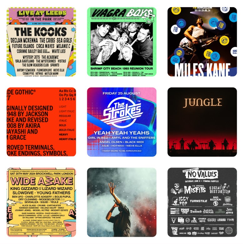
Overview: A mood board compiling images from music events, festival line ups and fonts that complimented the vision for the new Leeds Festival branding. The mood board has an alternative vibe with a mixture of vibrant colourful imagery and moody desaturated styles, these juxtaposing themes represent the variety of music genres that are included in Leeds Festival.
Typography: Whilst sourcing the images for the mood board, the typography used for music festivals were noted for being extremely varying styles, the overall vibe of the festival heavily influenced the typography. However, the chosen fonts were all bold and striking no matter what genre and this will be carried forward in the Leeds Festival branding.
Colour palette: Based on the user feedback survey (shown below in the colour planning section), users mainly associate red, black, and white with indie/rock music, however due to Leeds Festival expanding to include more genres in recent years a colourful theme to reflect this would be appropriate.
Imagery: The imagery of music artists included in the mood board stay within the red, black, and white colour palette. This is something that should be continued in the branding of Leeds Festival, to represent the legacy of the festival. Whilst researching current UK music festivals a common theme found throughout line up posters and festival websites was the use of illustrations. This design trend should be incorporated in the new Leeds Festival branding.
Colour Planning
The next step taken was to bring together a cohesive colour palette that embodies Leeds Festival, as mentioned earlier the user feedback confirmed that red, black, and white are seen as colours that most represent indie/rock. Please see below the feedback from the survey:
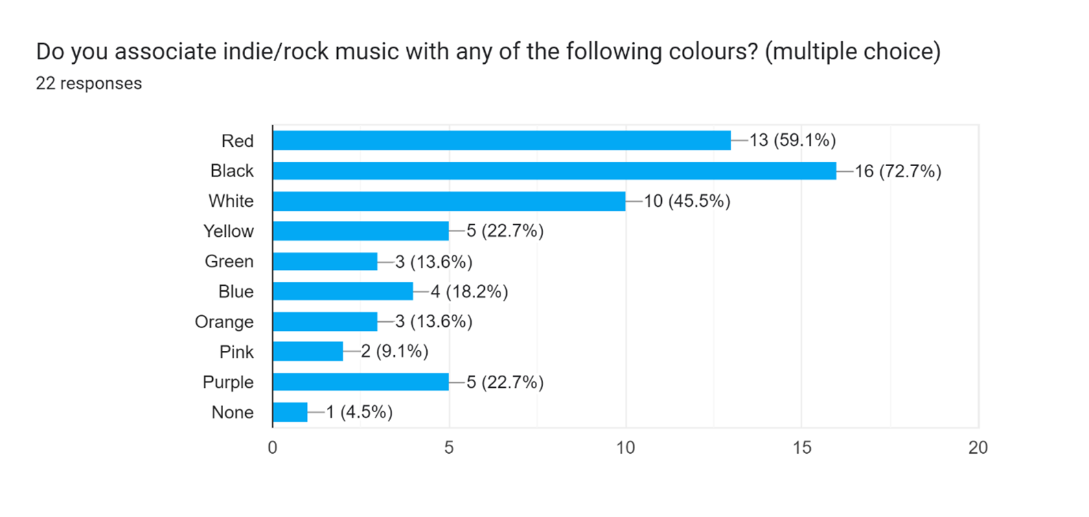
Based on this feedback red, black and white were chosen for the colour palette, however a decision to feature lighter, vibrant colours was made based on the research of competitor UK music festivals. Below is the potential colour palette chosen for the new Leeds Festival brand:
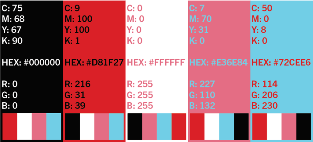
Black, red, and white represents the core of Leeds Festival, pink and blue were included to represent the summer season and reflect upon the colourful, illustrative trends that music festival branding is currently focusing on.
Mood Board Imagery References
Live At Leeds (2024) Live at Leeds in the park line up. Available online: https://www.liveatleeds.com/line-up [Accessed 22/3/2024].
Viagra Boys (2023) Viagra boys 2023 American tour dates [Photograph]. Available online: https://www.reddit.com/r/indieheads/comments/ye3fh8/viagra_boys_announce_new_tour_dates/ [Accessed 22/3/2024].
FIB Benicassim (2024) Miles Kane artist information [Photograph]. Available online: https://fiberfib.com/en/lineup/ [Accessed 22/3/2024].
No Values (2024) No Values line up poster. Available online: https://novalues.com/ [Accessed 22/3/2024].
Adobe fonts (2024) Trade gothic next font page. Available online: https://fonts.adobe.com/fonts/trade-gothic-next [Accessed 22/3/2024].
All Points East (2023) All points east line up poster. Available online: https://twitter.com/allpointseastuk/status/1617447086148177922/photo/1 [Accessed 22/3/2024].
Wide Awake (2024) Wide awake line up poster. Available online: https://wideawakelondon.co.uk/ [Accessed 22/3/2024].
McCord, J. (2023) Jungle performing at all points east [Photograph]. Available online: https://whenthehornblows.com/content/2023/8/1/festival-review-jungle-all-points-east-victoria-park-london-august-2023 [Accessed 22/3/2024].
Neill, A. (2017) Lead singer [Photograph]. Available online: https://unsplash.com/photos/man-in-gray-quarter-sleeved-shirt-singing-hgO1wFPXl3I [Accessed 22/3/2024].