This blog post will explore the principles of User Experience (UX) and User Interface (UI) with the aim of creating a website and companion app for a chosen festival. Throughout this post the ‘Double Diamond’ method will be used to discover, define, develop, and deliver.
Defining the UX for your Festival (Defining problem space, Usability Goals etc)
The chosen festival is Leeds Festival established in 1999. Leeds Festival is an annual music festival that takes place in Leeds, UK, it runs from Friday to Sunday during the August bank holiday weekend. The main musical genres included in Leeds Festival are rock, alternative, indie, punk and metal, however more recently hip hop, pop and dance have been introduced. Based on information collected by Statista (2023) these genres make up 4 of the top 5 listened to digital audio genres in the UK.
When organising a music festival there are numerous problem spaces, for Leeds Festival organisers these include but are not limited to the below:
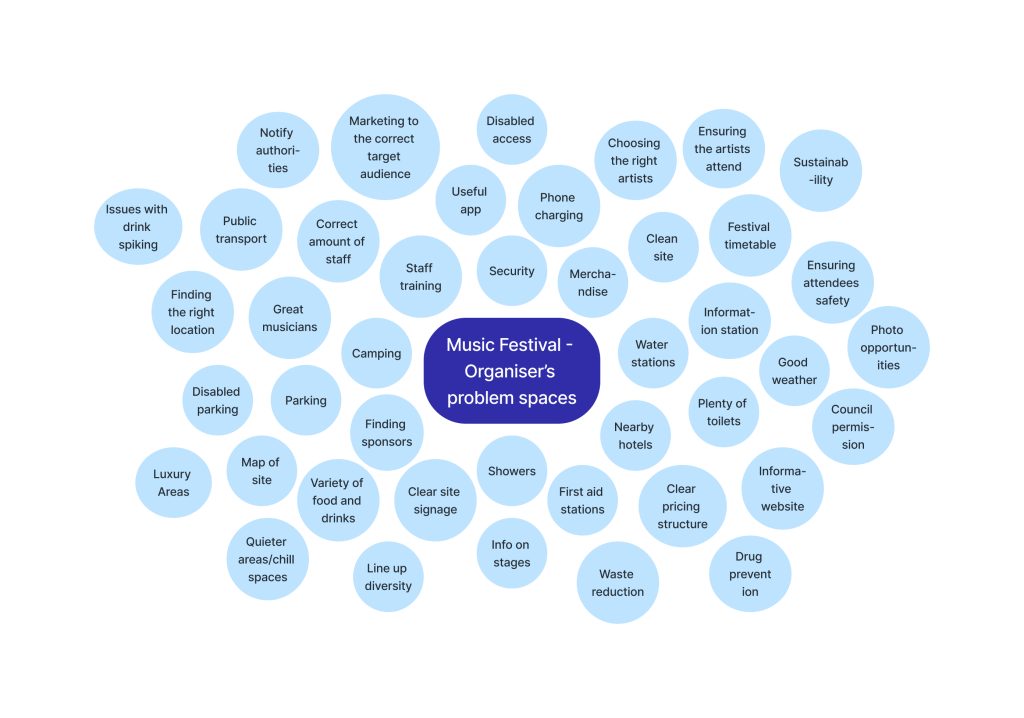
There is a large crossover of the organisers problem spaces with the festival attendees needs and requirements, please see below a few of these requirements:
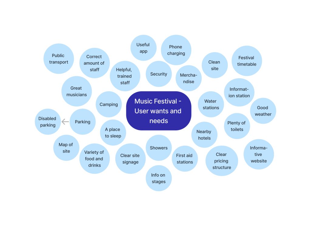
Customer reviews of Leeds Festival were utilised and highlighted pain points that are valuable for planning, these complaints included staff being unfriendly and undertrained, no lighting in the car park, people getting lost, litter not being collected, disappointing line up. These are all factors that must be taken into consideration to create a good user experience.
Tickets must be purchased through the festival website. The website should incorporate the six main usability goals that designers focus on, listed below with examples relating to Leeds Festival’s website:
- Efficient – easily navigable, visitors can buy tickets in a timely manner.
- Effective – visitors to the website can find the answers they are looking for by using a search bar.
- Learnability – the website should be intuitive to use, buttons should have clear prompts.
- Good utility – having everything a user needs on the homepage meaning they don’t have to hunt around the website and lose interest.
- Memorable – Jakob Neilsen cited by Allanwood and Beare (2019) made the point that users should not have to remember how to use a website or need to retrace steps.
- Error tolerance – putting a system in place that allows for website users to make spelling mistakes yet still find their required result.
The problem space differs for the website and companion app, as the websites main uses would be carried out prior to attending the festival to purchase the ticket and understand what to expect from the festival. Whereas the companion app would be used during the festival; to store the tickets, have a timetable of events, have a site map with information of first aid, toilets, stages, food, showers etc.
Requirements Gathering and Analysis
Leeds Festival’s website states they welcome all ages, however, have entry restrictions for under 16s. Based on information from Leeds City Council (2023) “approximately 55% of ticket holders [in 2022] were under 21 years.” Ticketmaster (2019) discovered that the most popular age range to attend a festival is 25-34. Ticketmaster’s research highlighted that whilst music is the top priority for attending music festivals, older fans are also interested in the social aspect, whereas younger fans are more interested in the experience and escapism of a festival. These statistics lead to the decision of the target audience for Leeds Festival being music fans from 16-34 years old with a focus on 16-21.
Based on background research the identified stakeholders have been entered into an interest influence grid including details of reasons they have an interest in Leeds Festival. Please see below the interest influence grid:
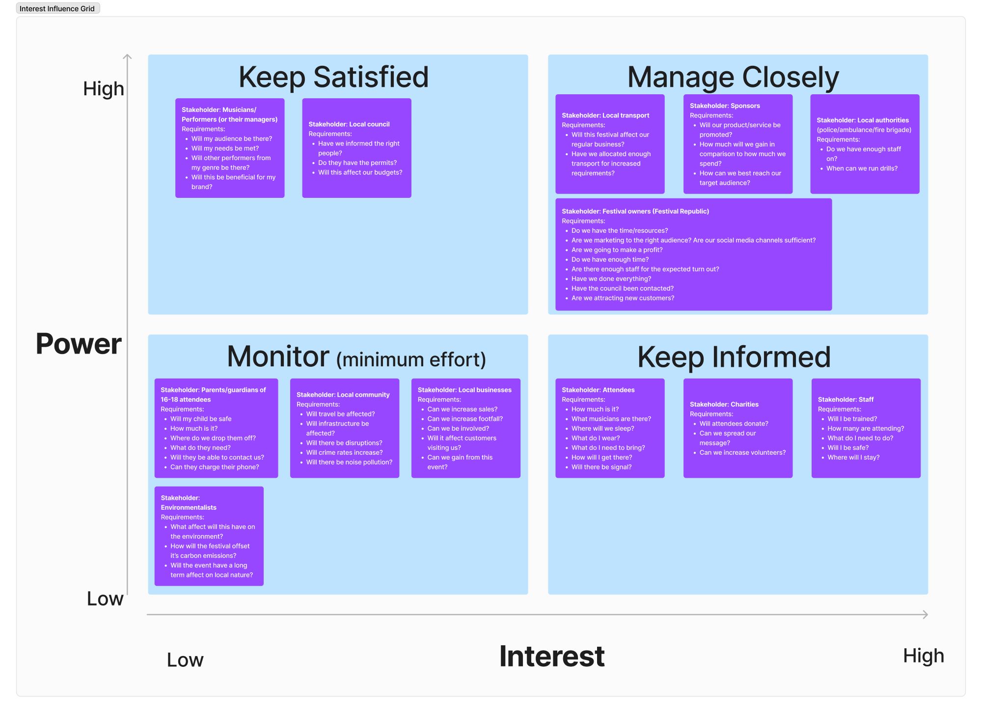
The primary user of the website is expected to align with the target audience of music fans aged 16-21. Through incorporating the six usability goals mentioned earlier into the website the primary user’s needs will be met. The website should be accessible for people with disabilities, conditions, or impairments, whether this be physical, cognitive or sensory. An accessibility statement, limited use of timed options, autofill fields and keyboard shortcuts will be included. Through the information architecture (IA) the website and app will be organised in a manner that will allow the ‘TAB’ order user friendly.
To better understand Leeds Festival’s website and app a Hierarchal Task Analysis (HTA) was completed, shown below:
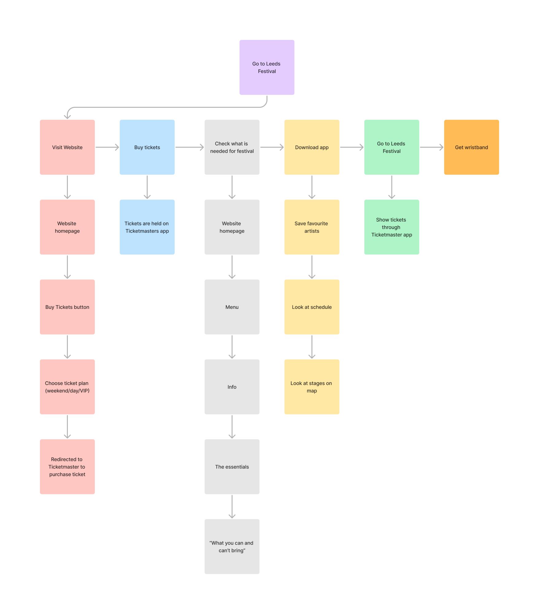
By completing this HTA pain points in the process of going to Leeds Festival were highlighted, these include:
- Tickets stored on Ticketmaster’s app as opposed to Leeds Festival’s app, this could have a negative impact on downloads of Leeds Festival’s app.
- No accessibility options for the website or app.
- No page on Leeds Festival’s website informing attendees what to bring.
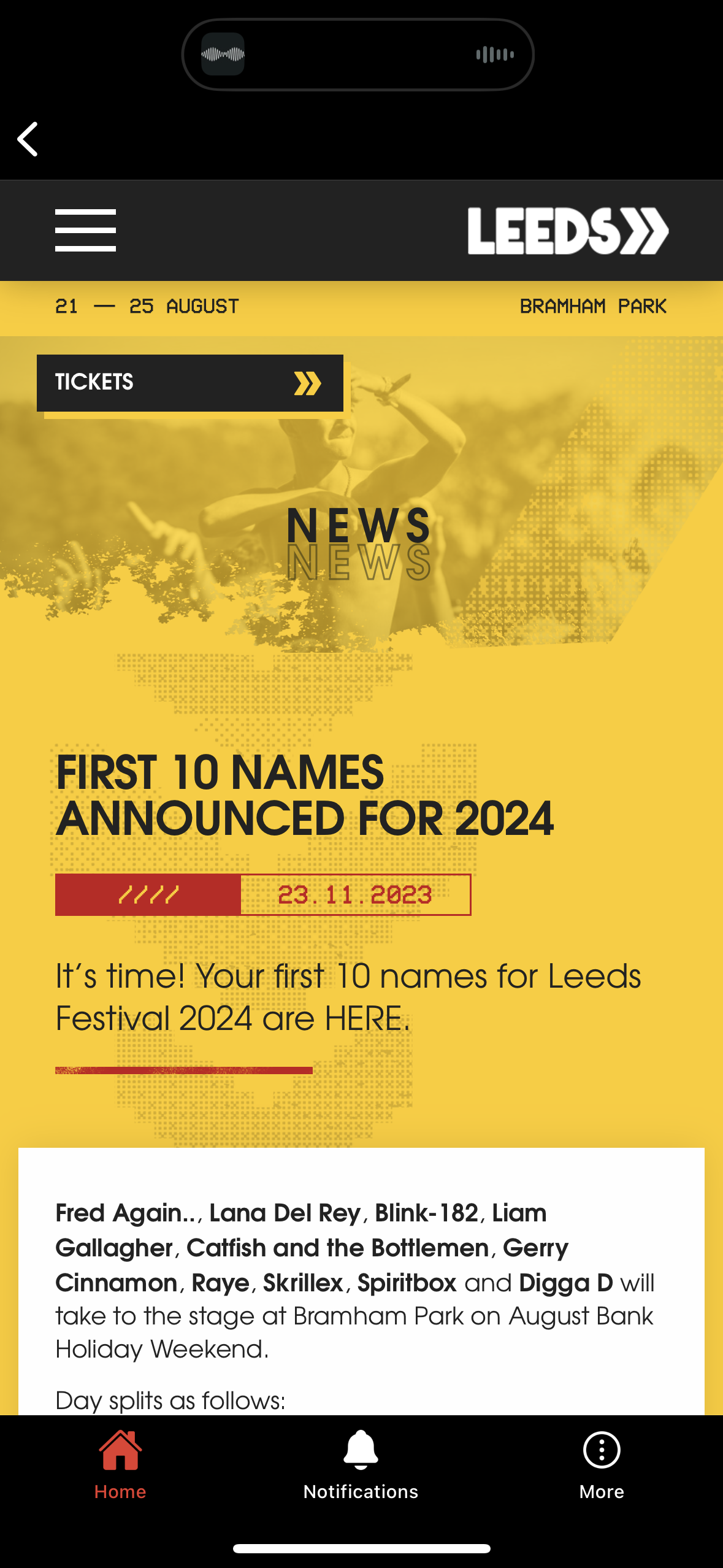
- The line-up does not clearly display which dates the headliners are attending (please see below image).
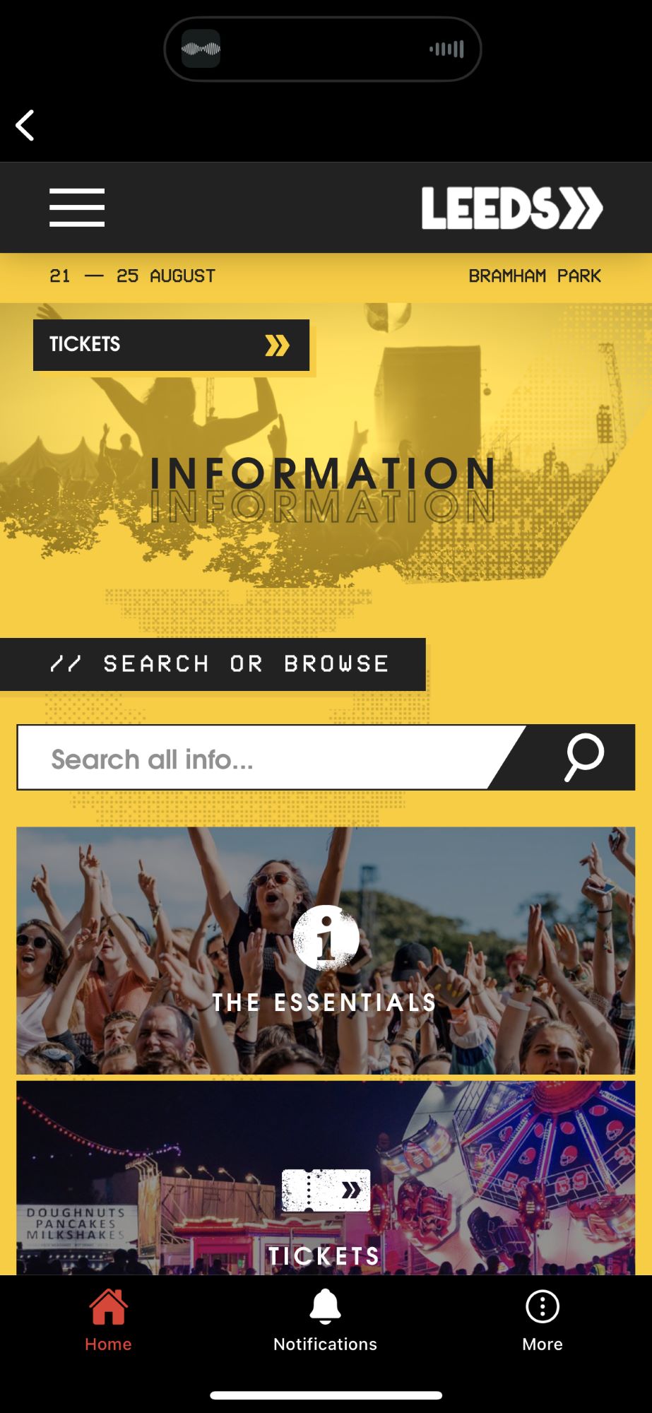
- No search bar on the home page.
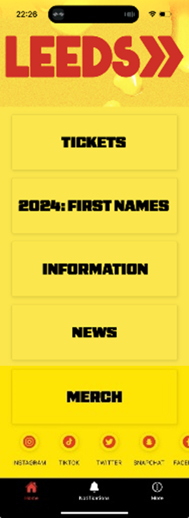
- The interaction Design Foundation (2020) made the point that mobile users “prefer short, simple interaction”. Using the call-to-action buttons on the home page of the app leads to the website (please see below), this leads to additional steps being taken.

Positive takeaways the HTA highlighted that will be carried forward in the design pattern when recreating the website and companion app are:
- Having a clear prompt to buy tickets.
- Labelled buttons with visual clues, meaning the website is efficient.
- Easily navigable and therefore learnable and memorable.
- Clear pricing structure for tickets.
- Information pages for travel, where to stay, accessibility information, personal safety and more.
To further develop the user’s journey, six personas were created based on the user research earlier mentioned plus, a map of Northern England and the 2021 Census (Office for National Statistics, 2023) to ensure that the users were within the correct demographic and area for visiting the festival. The personas were then transferred into a user journey map using assumptions on how a festival website and app would be used, which can both be seen below:
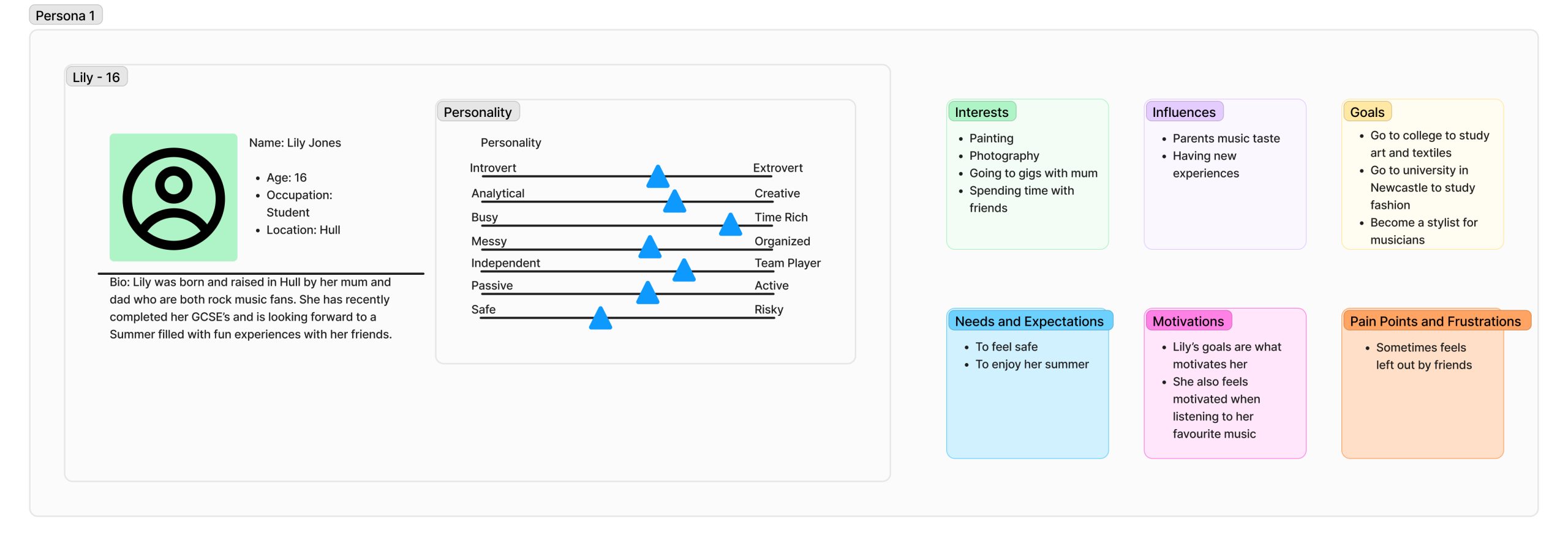

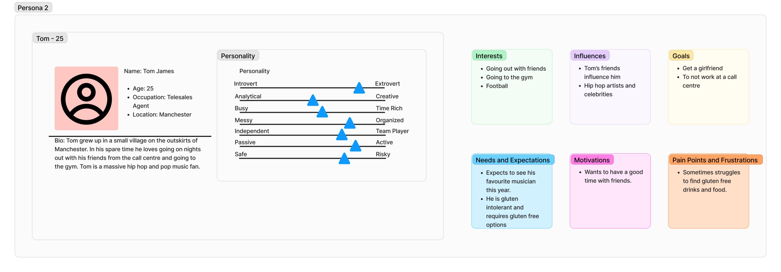
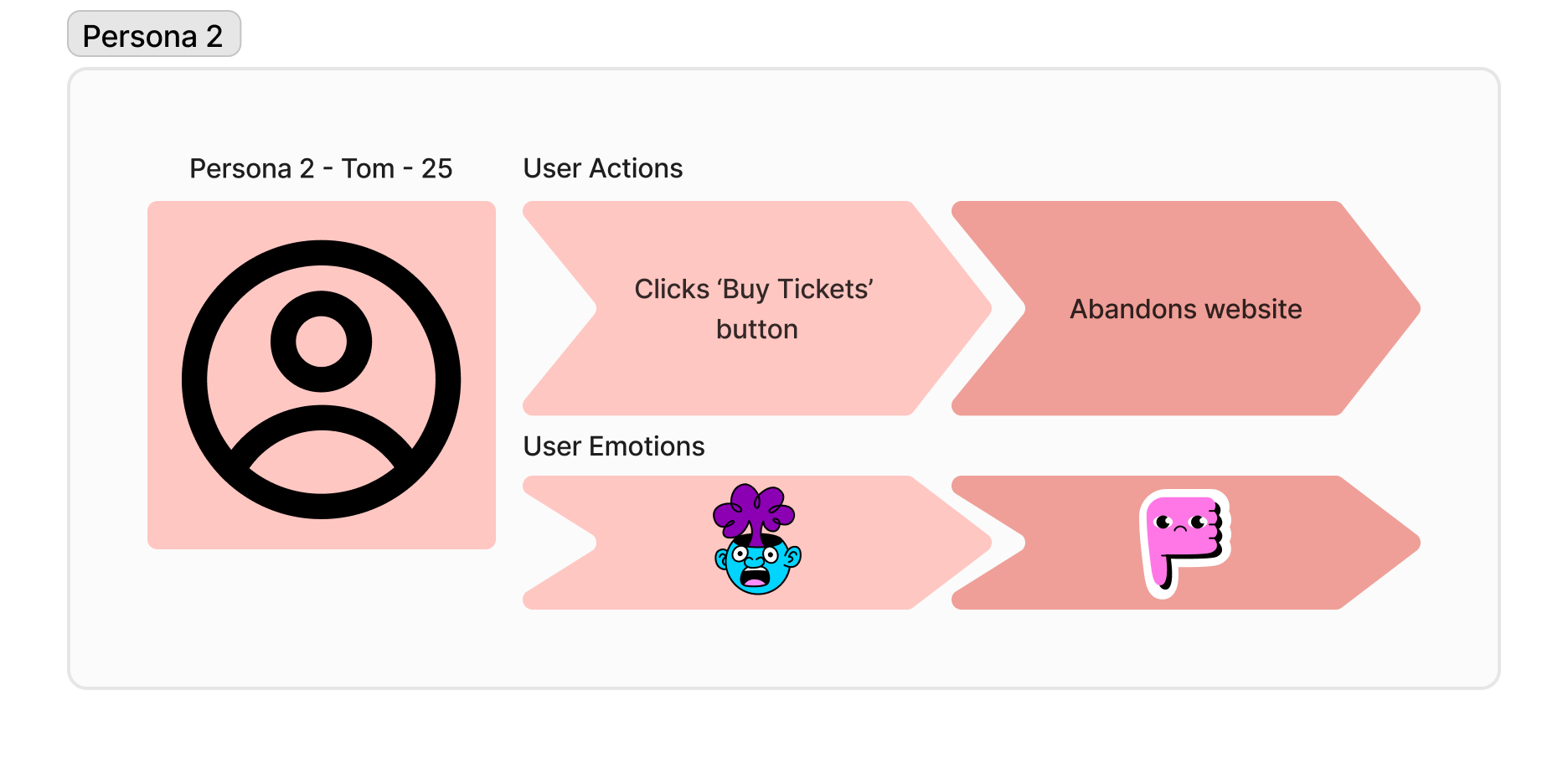
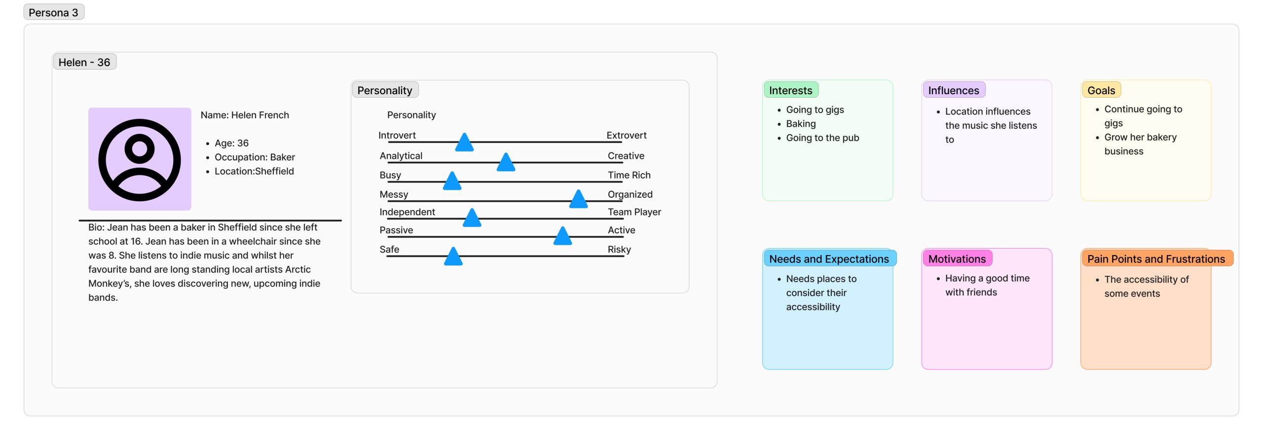

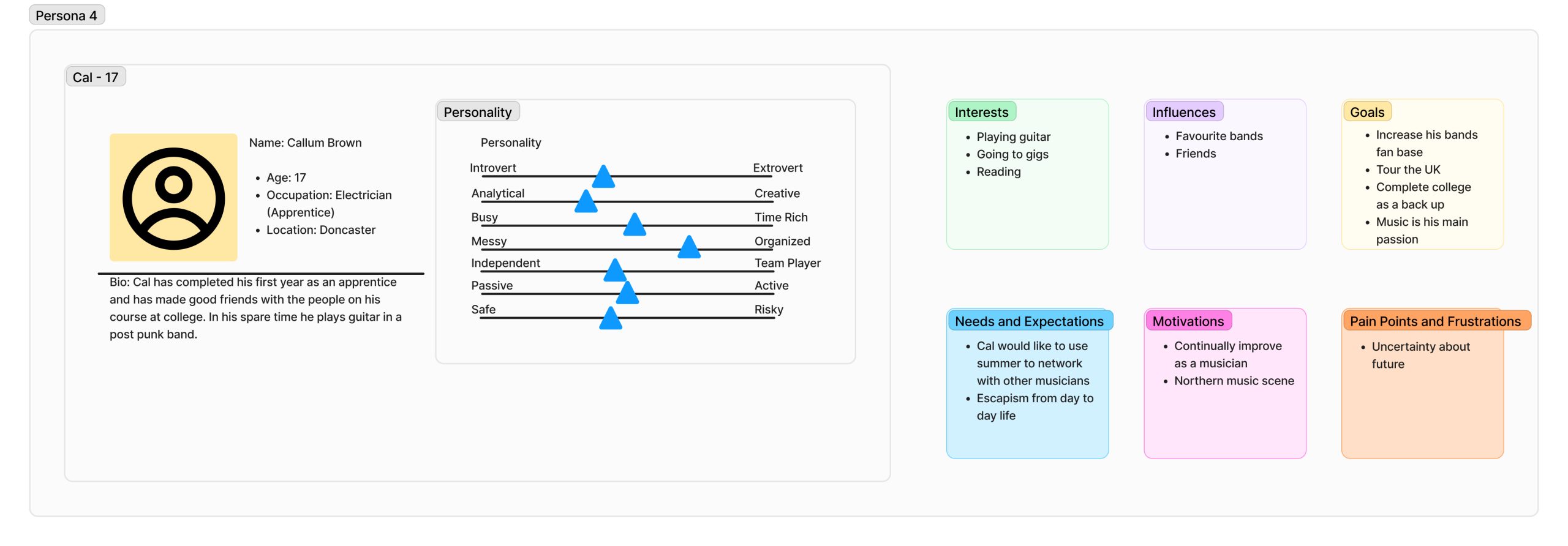

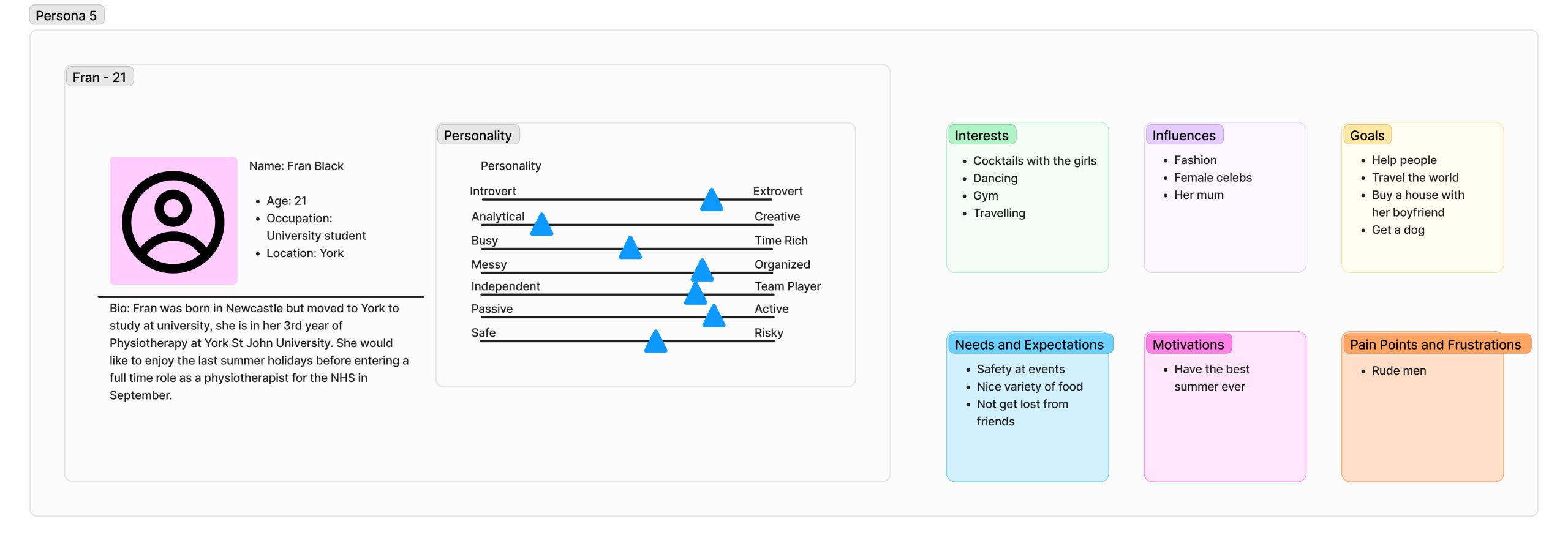

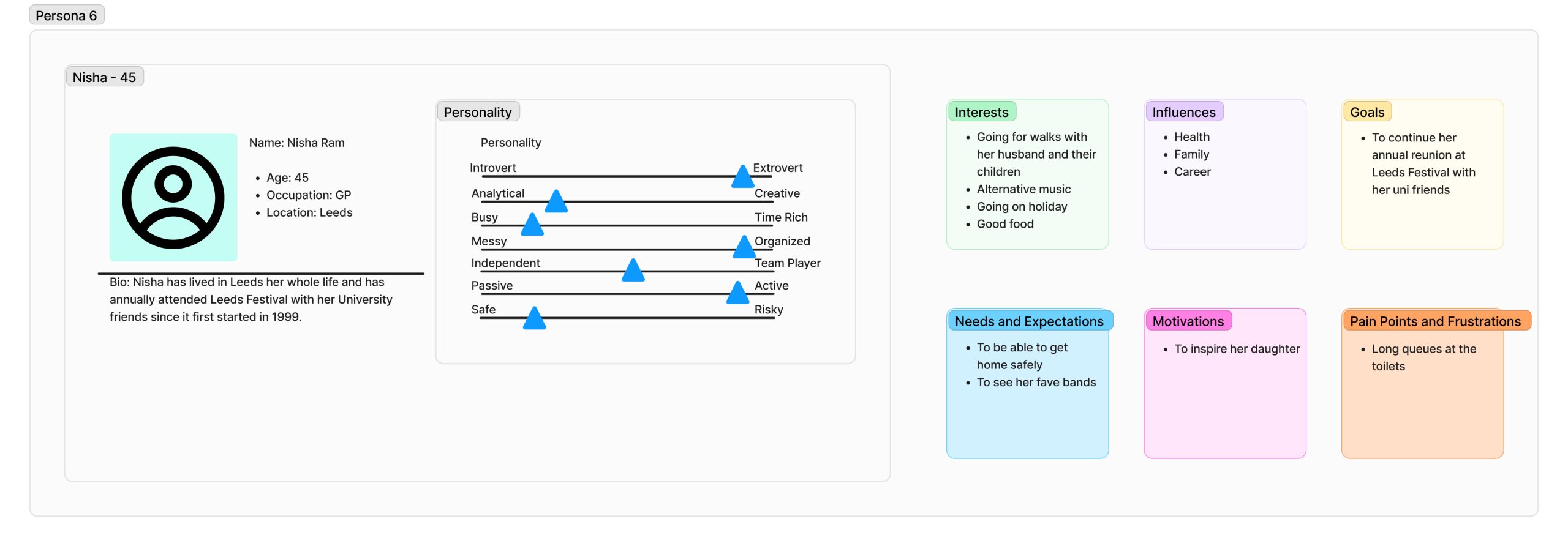

Through varying personas and user journey maps additional user requirements were identified, which will help in the “prevention of self-referential design” (Miaskiewicz and Kozar, 2011). To create a successful website and companion app a user centred design (USD) approach should be applied, additionally the designer should observe the user’s experience, then analyse this data to improve the end user’s interaction. These user experiences can be trialled using low fidelity prototypes.
UI principles to be applied to your design
To ensure consistency throughout the festival’s website and companion app design laws will be created/followed to support the best user experience, along with a coherent user interface through incorporating usability goals. Examples of these laws include:
- Making clickable buttons obvious through prompts and clearly labelling them, helping the user to efficiently make their decision.
- Not overcrowding a page with too many decisions, this links to Hick’s law, if there are too many options the user may spend an increased amount of time trying to decide and this could result in them abandoning the website.
- Ensure the website and app are easily navigable, making them learnable and error tolerant.
- Use a colour palette that is contrasting, meaning that content will be easily viewable, with additional options for greyscale, invert colour and sepia to offer users with sight impairments inclusion.
- When it comes to fields that are required to be filled, clearly labelling them, and highlighting the compulsory fields.
- Making sure font size and spacing is user friendly.
- Clearly show when an option is no longer available, for example grey out sold out ticket options.
Similarly, to the above design laws, feedback should be added in the form of prompts or reactions to further improve the user experience. Examples of this feedback include:
- Showing a loading wheel (in the form of something music related) if a website page is taking a while to load.
- Having a digital queue for tickets if there are too many users trying to access them.
- Clearly showing which step of the ticket purchasing process a user is on and how many steps there are in total.
- When filling in fields ticking the ones that are already completed and highlighting in red any information that is still required.
In addition to providing feedback when decisions are made by the user, call to actions should be included in the interaction design (IxD) to guide users to making the right decisions. These call to actions should allow users to seamlessly continue their journey from one page to the next and ensure that the design/website responds in the way the user would expect.
The overall interface of the festivals website and companion app will be adaptable depending on who/where/how it is being used. These different interfaces may entail the layout to change depending on screen size or making use of an accessibility button that can alter the interfaces font size, colour or audio settings as previously discussed.
Rejected designs
Below are a few examples of low fidelity prototypes that did not meet the user’s needs and requirements for various reasons.
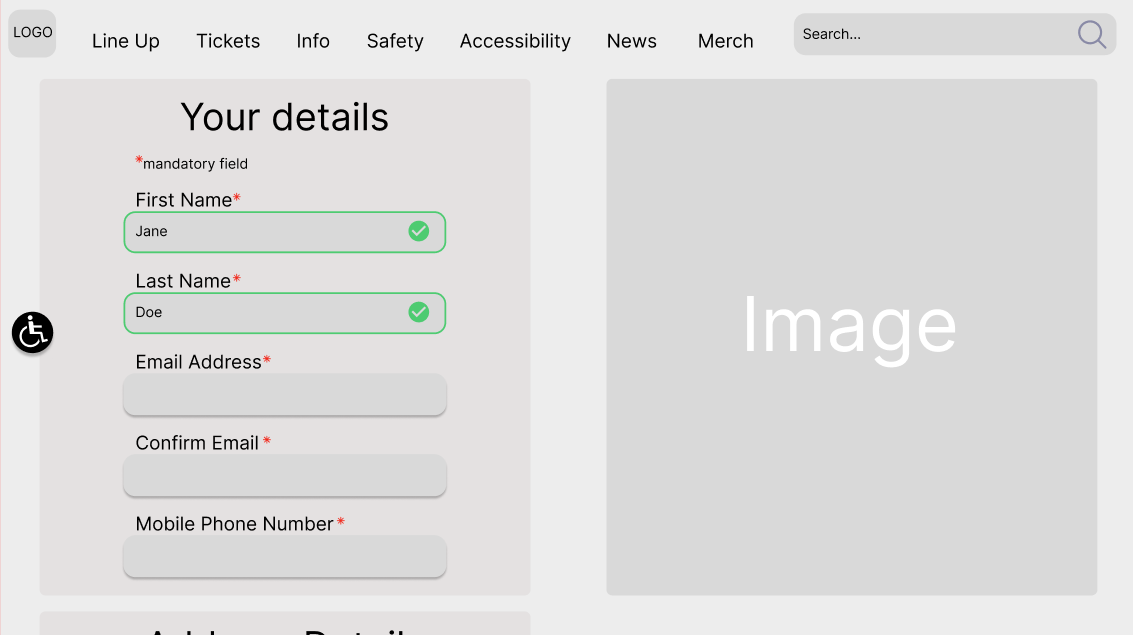
Whilst this design has clearly marked fields and positive feedback when a field has been completed, there are no indicators along the top showing which phase of the ticket buying process the user is currently at.
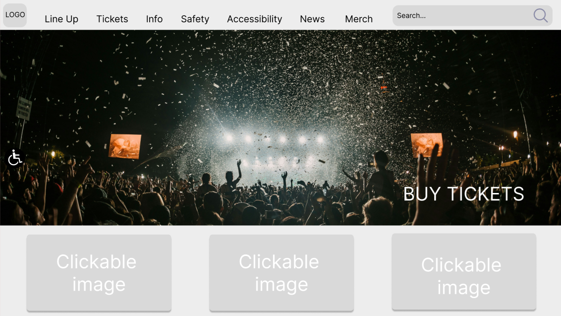
The second design was rejected due to the ‘BUY TICKETS’ button not being a clear clickable button. Additionally, the accessibility button on the left cannot be seen clearly.
Low fidelity UI prototype
Through low fidelity prototypes the IxD is studied, the way users navigate through low fidelity prototypes will be assessed and confirm which aspects work and what requires further development. Once these low fidelity prototypes are working best for the UX, they will be converted to high fidelity prototypes and usability will then be tested through Human Computer Interaction (HCI). Please see below low fidelity prototypes of the website and companion app for Leeds Festival.
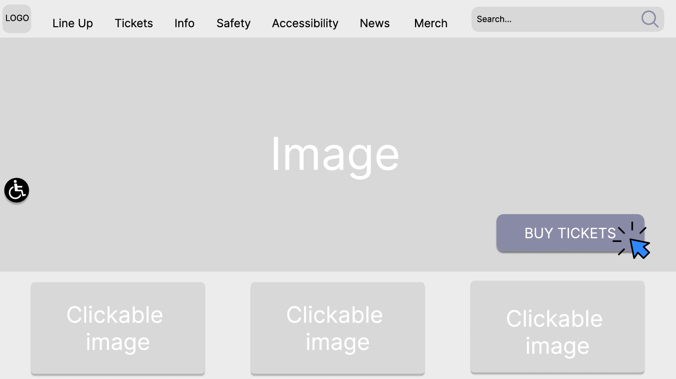
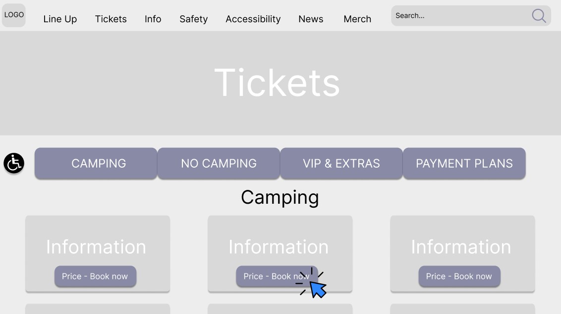
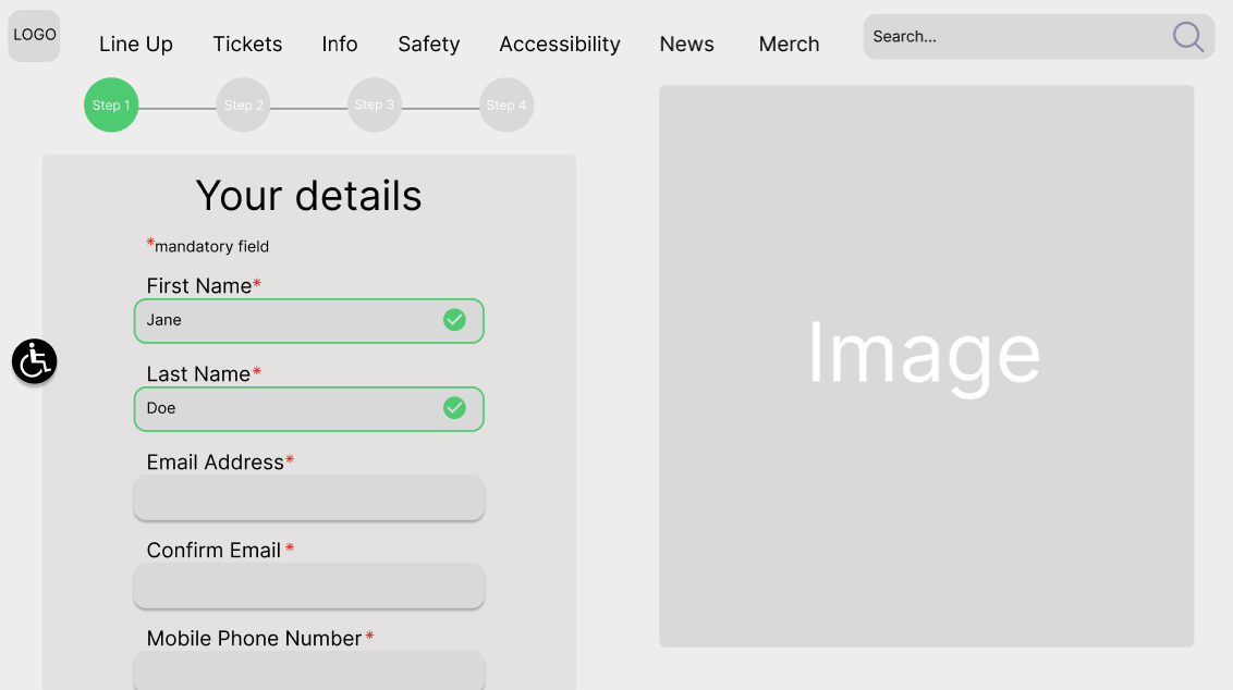
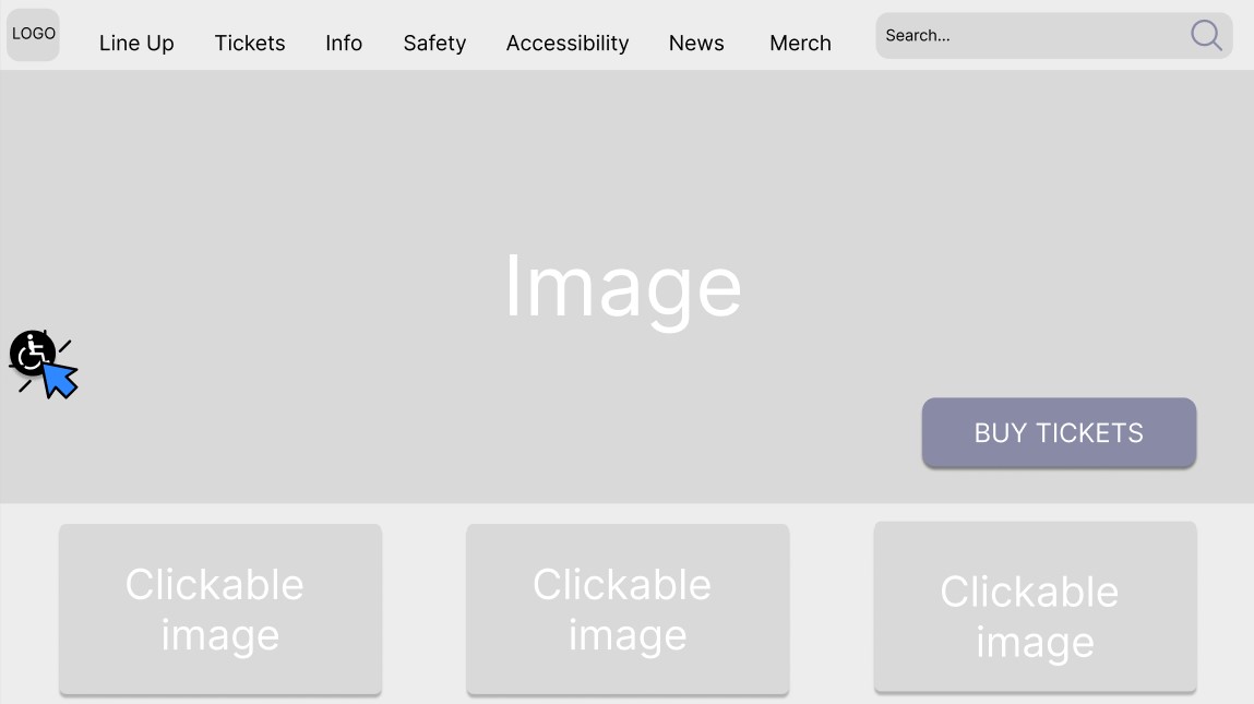
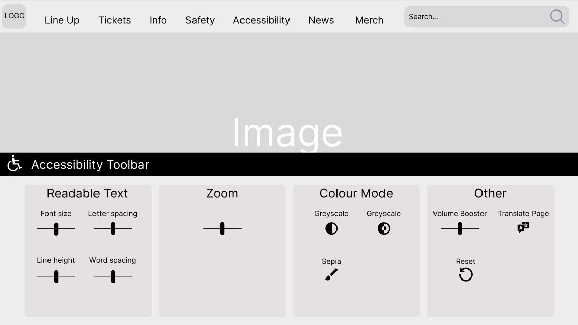
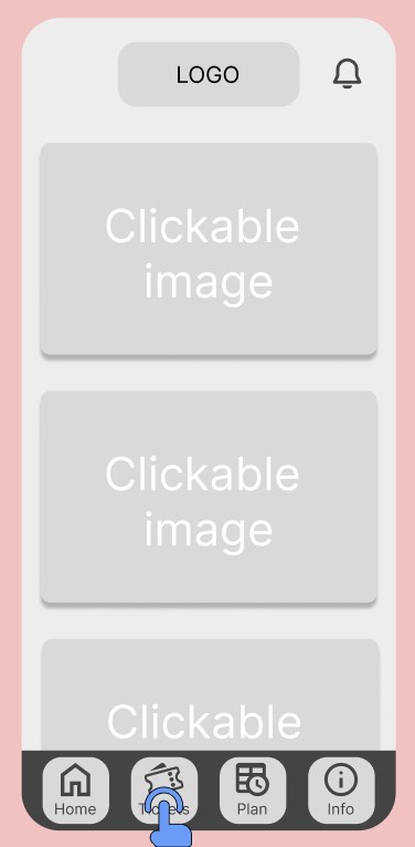
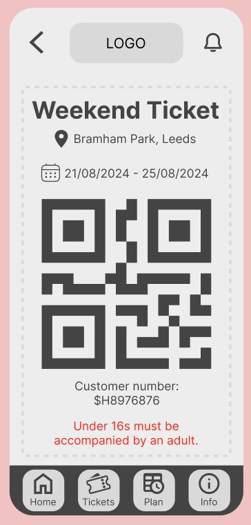
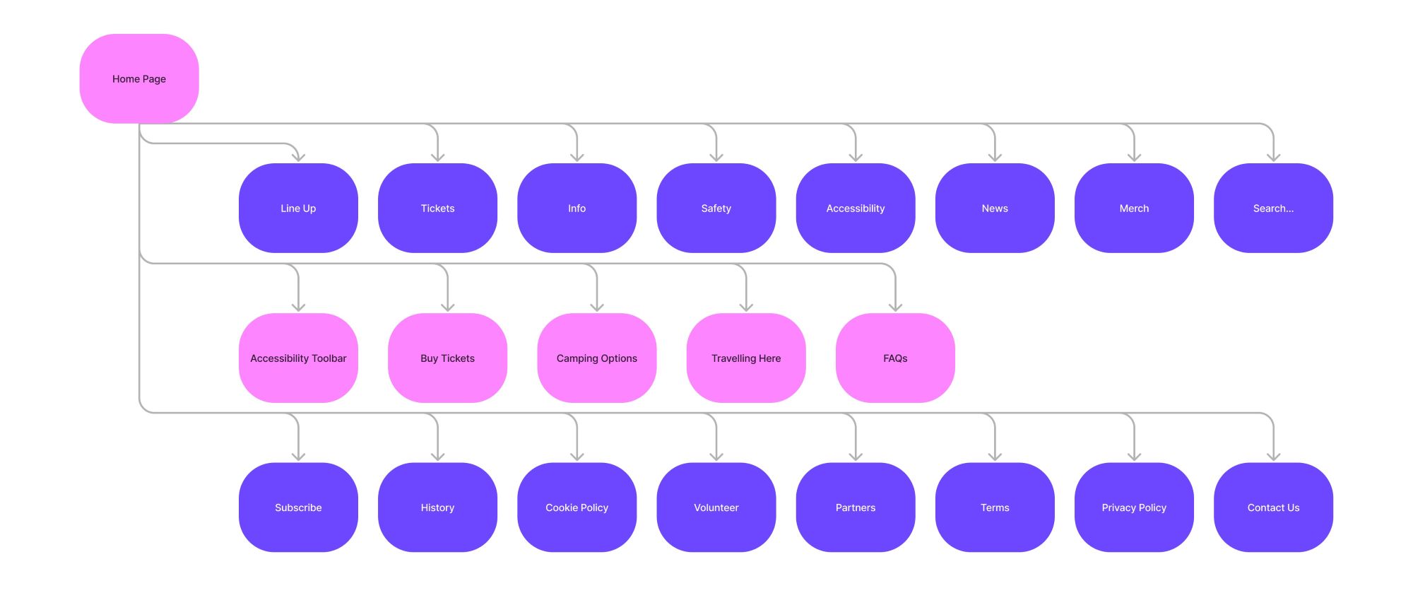
Through creating these low fidelity prototypes and the flowchart flaws have been found in the number of options on the home page, when creating the next phase of prototypes these options will be refined. Although improvements are required, by completing this development research process the UX and UI principles have been implemented in the low fidelity prototypes.
References
Allanwood, G. & Beare, P. (2019) User experience design: a practical introduction. London: Bloomsbury Publishing Plc.
Interaction Design Foundation – IxDF (2020) Mobile Usability Research – The Important Differences from the Desktop. Available online: https://www.interaction-design.org/literature/article/mobile-usability-research-the-important-differences-from-the-desktop [Accessed 7/3/2024].
Leeds City Council (2023) Leeds festival 2023. Available online: https://democracy.leeds.gov.uk/%28X%281%29S%28fkn0jfigeevz5oferbjpjk55%29%29/mgAi.aspx?ID=94003 [Accessed 5/3/2024].
Miaskiewicz, T. & Kozar, K. A. (2011) Personas and user-centered design: How can personas benefit product design processes? Science Direct, 32(5), 417-430.
Office for National Statistics (2023) How life has changed in Leeds: Census 2021 (19 January 2023). Available online: https://www.ons.gov.uk/visualisations/censusareachanges/E08000035/ [Accessed 5/3/2024].
Statista (2023) Preferred digital audio by genre in the UK as of December 2023. Available online: https://www.statista.com/forecasts/997919/preferred-digital-audio-by-genre-in-the-uk#:~:text=%22Pop%20%2F%20adult%20contemporary%20music%22,Preferred%20digital%20audio%20by%20genre%22. [Accessed 4/3/2024].
Ticketmaster (2019) State of Play: Festivals UK. Available online: https://business.ticketmaster.co.uk/wp-content/uploads/2019/10/State-of-Play-Festivals-UK-2019.pdf [Accessed 5/3/2024].