Typographical standards ensure that all content created for a company is distinctive and in keeping with the brand’s identity. To create a strong brand identity specific colours, typography, logos, and illustrations are introduced, these elements are what helps the customer differentiate this brand from the rest.
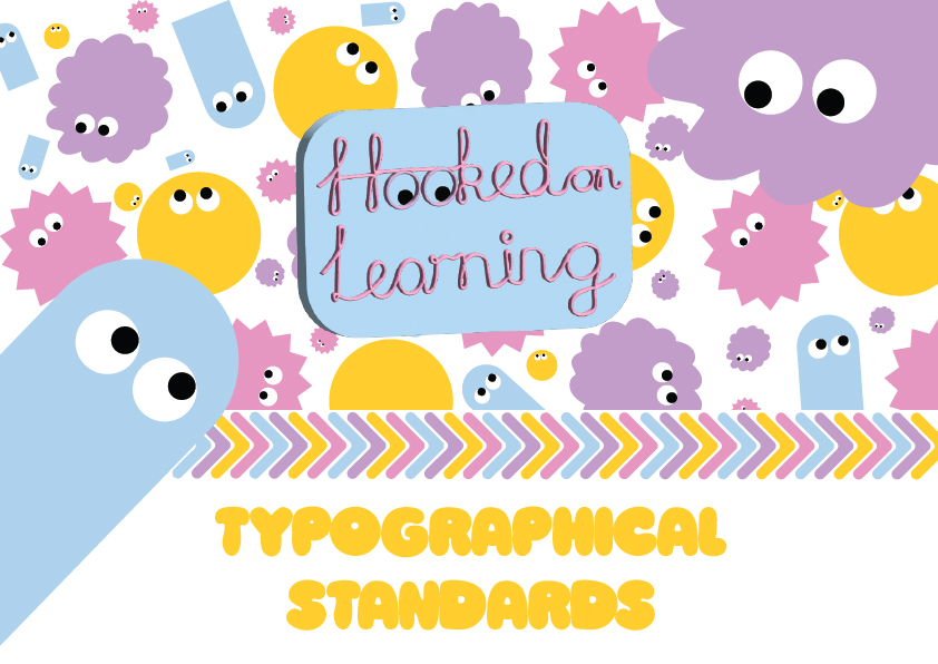
Hooked on Learning’s Typographical Standards
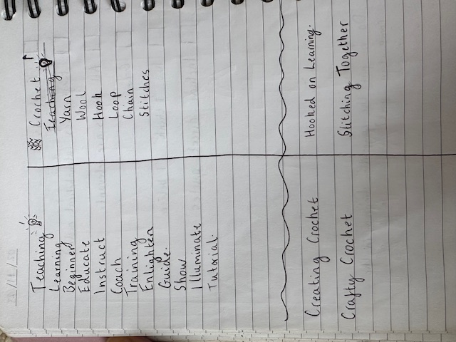
The task was to create typographical graphic standards for a company that’s purpose is to teach crochet to 18-30 year olds, I firstly had to decide on a company name. To do this I wrote a list of words that were linked to the purpose – teaching and the subject – crochet, I then combined the two and landed on ‘Hooked on Learning’.
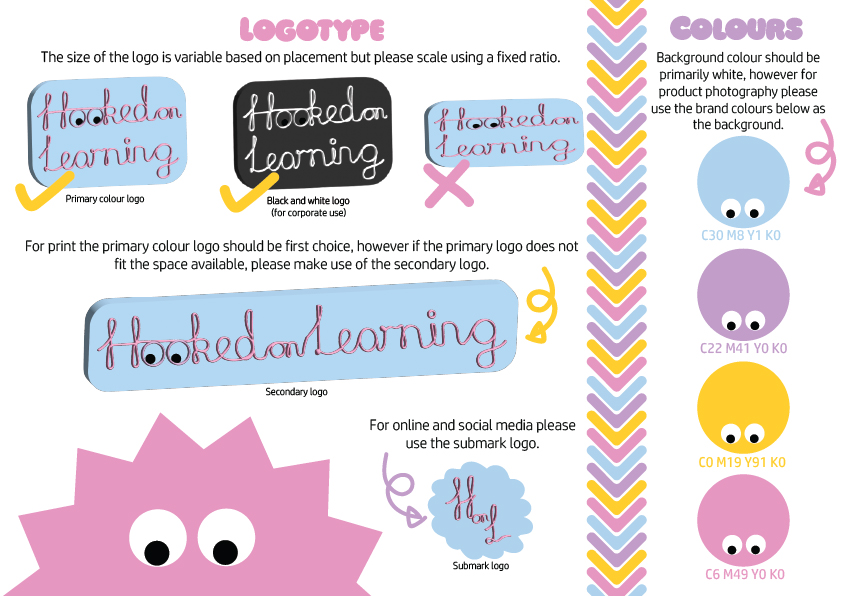
Once the name was decided it was time to choose a colour palette, due to the audience being 18-30 my immediate thought was to incorporate bright, vibrant colours that drew the reader’s attention. For inspiration, I looked through images that I had taken over the years of items that I have crocheted and quickly noticed that most images were taken against a purple, blue or yellow background, leading to the chosen colour pallet. I wanted to introduce a fourth colour that was coherent, I created an illustration of crochet stitches using the chosen colours and used this to test the fourth colour (please see below). Pink complemented the others favourably and so the colour palette was established. Ward et al. (2020) states that colour “is more challenging to develop as a unique brand identifier due to high levels of competitive sharing.” However, due to the research I had carried out on crochet books and crochet companies I felt positive about the colour palette chosen.

The next step was to create the logos to be include in the typographical standards, the creation of these logos and the correct usage is discussed in detail within the post Traditional or Online Conceptual Editorial Masthead (Logo) Design.
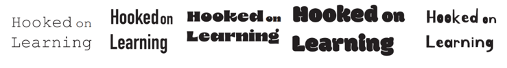
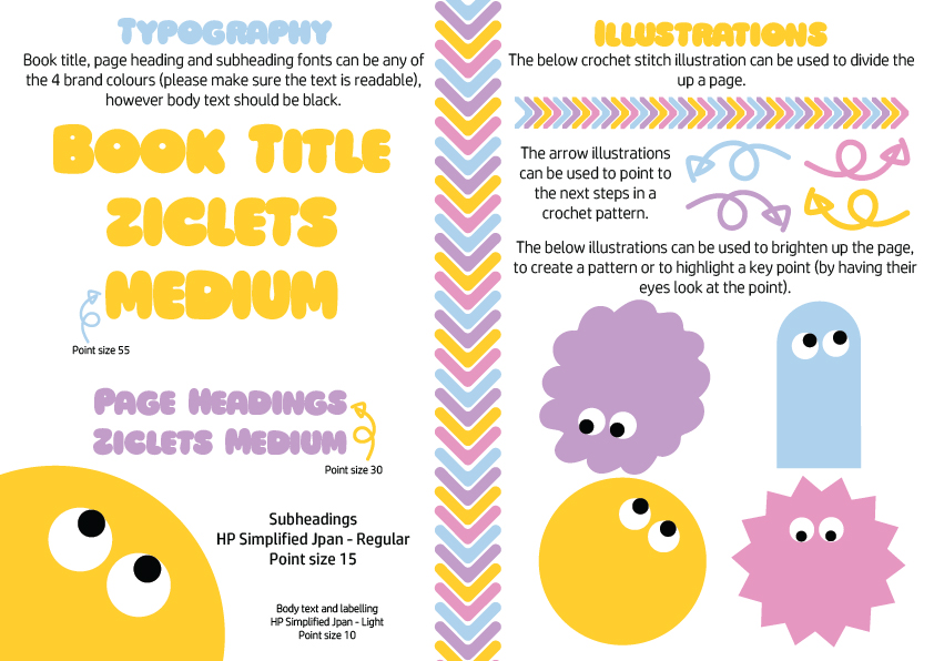
Typography was the next decision to make, keeping in mind that the editorial pieces I was going to design were books, the chosen font needed to be appropriate for a book cover but also, a supporting font that would be suitable for the contents of a book was required. Initially I used Adobe Illustrator to view ‘Hooked on Learning’ in a variety of typefaces. It quickly became clear that a bubbly, rounded, bold, sans serif typeface fitted this brand’s identity. Ziclets stood out as the perfect typeface for this fun, vibrant and friendly company, as it clearly communicated these characteristics, by looking at the book titles the reader will know what vibe to expect. The accompanying typeface to be used for subheadings and body text was HP Simplified Jpan, it is also sans serif and has rounded ends but is easier to read in a smaller size.
The idea for the character illustrations derived from the logo, they connect to the googly eyes in ‘Hooked’ and they add to the distinctive brand identity. The arrow illustrations are to allow key points and next steps within the books to be clearly indicated to the readers learning to crochet. The crochet stitch illustration allowed for the typographical standards pages to be divided into clear and concise sections. Other aspects that I would introduce in future typographical standards would be to include the correct spacing, imagery of branded products and the correct usage of imagery within the books.
References
Ward, E., Yang, S., Romaniuk, J. & Beal, V. (2020) Building a unique brand identity: measuring the relative ownership potential of brand identity element types. Springer Link, 27(1), 393–407.