A company’s logo should be the most recognisable aspect of a brand, Erjansola et al. (2021) describe a logo as a “brand-management tool used in a carefully planned process to create brand equity, customer commitment and competitive distinctiveness.” To create a logo that catches the eye of the company’s target audience it is important to incorporate the company’s key characteristics.
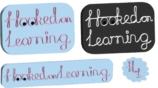
Hooked on Learning’s Conceptual Logos
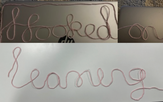
To create the conceptual logo for ‘Hooked on Learning’ (a company that’s aim is to teach 18-30 year olds how to crochet) I searched for a cursive typeface, with the aim of it having the appearance of yarn however, I struggled to find one that was appropriate. Consequently, I physically laid out yarn to display the words ‘Hooked on Learning’ (please see below), I then took photographs, uploaded them to Adobe Illustrator and traced over them. Guidelines were used on Adobe Illustrator to ensure there was a baseline and a consistent x-height, cap height and point size. Once complete, the next step was to add a couple of 3D effects to the string like cursive writing, this is when the font took shape and looked like yarn used to crochet.
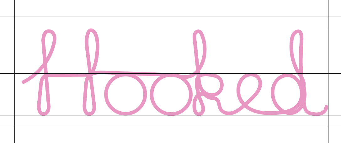
Now that I had incorporated the crochet aspect of the company through the yarn, I planned on including an icon that would represent the learning/teaching side of the company. I considered how I learnt to crochet, which was through using my eyes to look at books and videos, I adapted the ‘oo’ in ‘Hooked’ to look like eyes, specifically the safety eyes often used when crocheting soft toys.
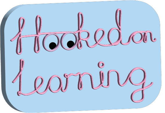
For the typography within the logo I chose pink, but wanted to create a background to ensure that the logo would be clearly visible when on a white background, for this blue seemed the perfect choice. With this logo being for a crochet company rather than having a rectangular shape with angular, sharp corners it was more appropriate to round the corners of the blue rectangle and additionally add a 3D effect to link it to the yarn like typography.
After the primary logo was complete, it was time to create the full set of logos for the typographical graphic standards. Each of the logos were created with a specific use in mind; The primary logo is a colourful emblem logo, this should be the first choice if spacing permits. For corporate use, I created a black and white version because this design is still identifiable with the brand but is more formal and appropriate for business use. For the correct use of these logos, they should always be kept to the specific ratio when scaled. At times when this ratio does not fit the wordmark logo may be used and for social media purposes the letter mark logo would work best.
References
Erjansola, A. M., Lipponen, J., Vehkalathi, K., Aula, H., M. & Pirttila-Backman, A., M. (2021) From the brand logo to brand associations and the corporate identity: visual and identity-based logo associations in a university merger. Springer Link, 28(1), 241-253.