They say don’t judge a book by its cover but when I’m buying a book it is often the covers that draws me in and I’m not the only one, research suggests that cover designs can increase the visibility of books by 50% (Morr, 2017).
Hooked on Learning’s Book Covers
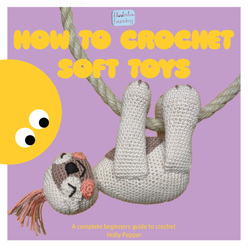
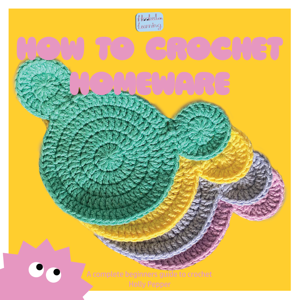
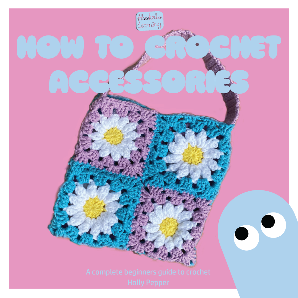
For the cover pages my aim was to create covers for a series of books teaching people ‘How to Crochet’ a variety of items, I wanted the designs to be colourful and bold, yet simple. The target audience is 18-30 year olds and being in this age demographic myself I am aware what would stand out on the shelf to this audience. To create the bold, colourful designs I aspired to, I started by using the Hooked on Learning’s colour palette from the typographical graphic standards to fill each page, whilst keeping the same white margins as in the two-page spreads. I then added the book titles in the typeface Ziclets Medium, point size 55 as confirmed in the typographical graphic standards, on each cover I chose a contrasting colour for the title. I then added the primary Hooked on Learning logo to the top centre of each cover, the choice of title was intended to follow on from the logo, when read continuously each logo/book title reads as ‘Hooked on Learning How to Crochet…’. I now had the base for each design.
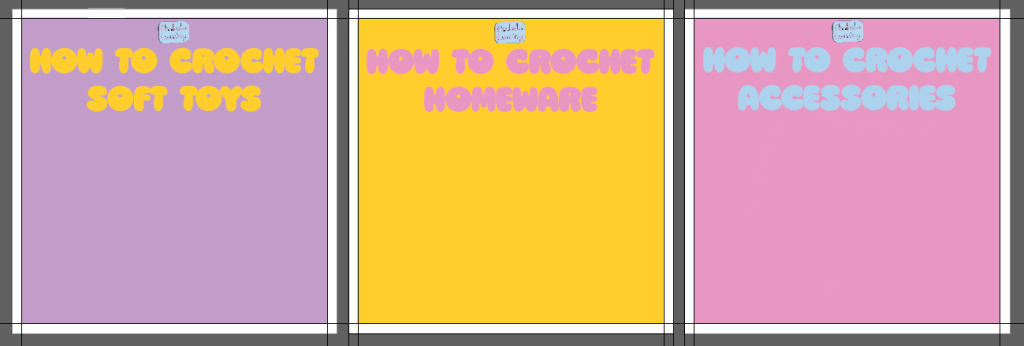
Rather than fill the covers with multiple illustrations or images of crocheted items I wanted to show one key piece that would draw the target audience in. Looking through images I had photographed of items I have crocheted I found colourful/interesting images suitable for each cover (please see below). Each image was opened in Adobe Photoshop and the background was removed, ready for them to be placed on the covers.
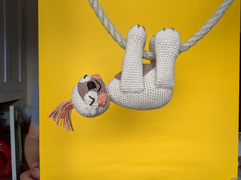
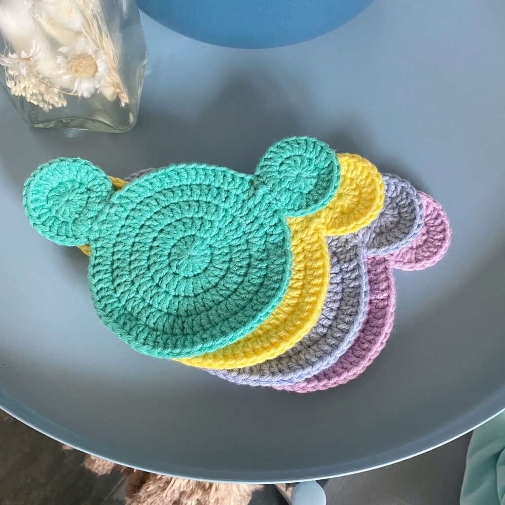
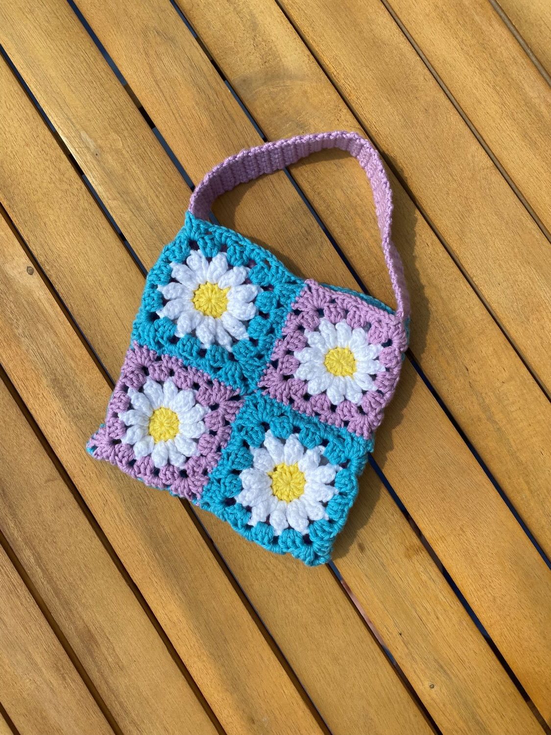
I was happy with how the designs were looking but still had a few small details to insert, when researching crochet books, I found that traditionally there is a subtitle that helps consumers know what is inside without having to read the blurb. For the subtitle of Hooked on Learnings books I chose for it to be at the centre bottom of the cover and in the HP Simplified Jpan typeface so as not to be intrusive and detract from the attention of the book title, I also added the author’s name underneath in the same font. Originally this text was black but that did not match the style of the cover, consequently these were adjusted to match the colour of the title.
Lastly, I included an illustrative character on each book cover to further imply the fun, quirky mood that the target audience can expect when reading these books. Each character chosen was the matching colour to the text. Whilst the complete book covers are bold and colourful, the design element only uses two colours on each, this means that focus is not taken away from the element that matters most, the crocheted items.
Reference
Morr, K. (2017) How cover design can increase book visibility by 50% (or more). Available online: https://99designs.com/blog/tips/impact-book-cover-design-on-sales/ [Accessed 8/1/2024].
Whilst I crocheted the contents of the imagery the patterns were written as follows (patterns not mentioned were developed by myself):
Sloth – essiebirdies