The layout of a book varies hugely dependent on the genre, creative educational books rely heavily on pictures to give the reader a good example of what the finished product/craft should look like.
Four two-page spreads from Hooked on Learning’s Books
For this section of the assignment, I chose to create 4 two-page spreads for a book. The book is an informative guide teaching 18-30 year olds how to crochet and includes patterns for creating soft toys. Forming an interesting layout was a priority however, the layout had to be easy to follow due to the audience being crochet beginners.
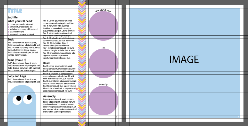
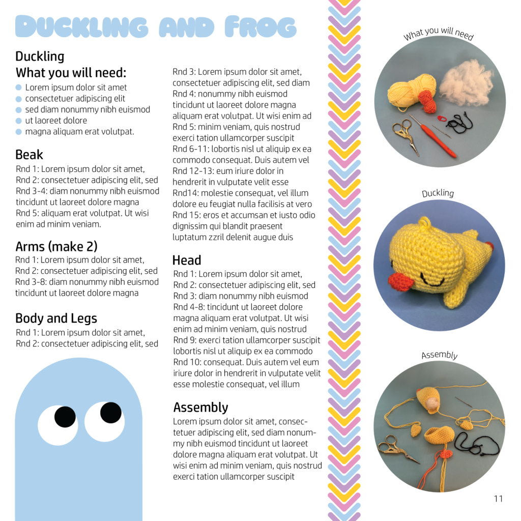
Before designing the two-page spreads I created a master compositional grid to ensure that each set of pages were cohesive and followed the same layout (please see above). For the master compositional grid, I chose to complete the designs on two 200 x 200mm pages because this size perfectly suits the crochet genre, as it allows the reader to fold the book in half and have a 200 x 200mm page on their lap whilst they crochet. Once the page size was determined, I introduced guidelines that allowed for a clear page structure, this included a margin around the edge of each page, page numbers in the bottom right corner of each page and a clear place for the page title, subheading and body text.
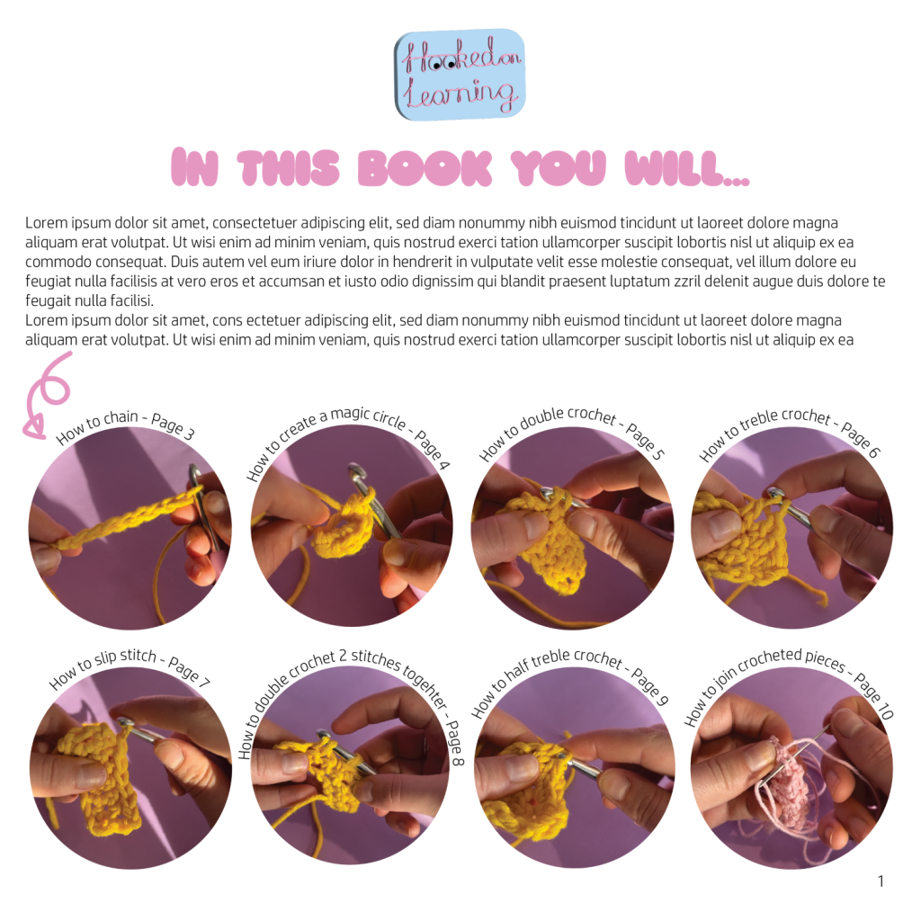
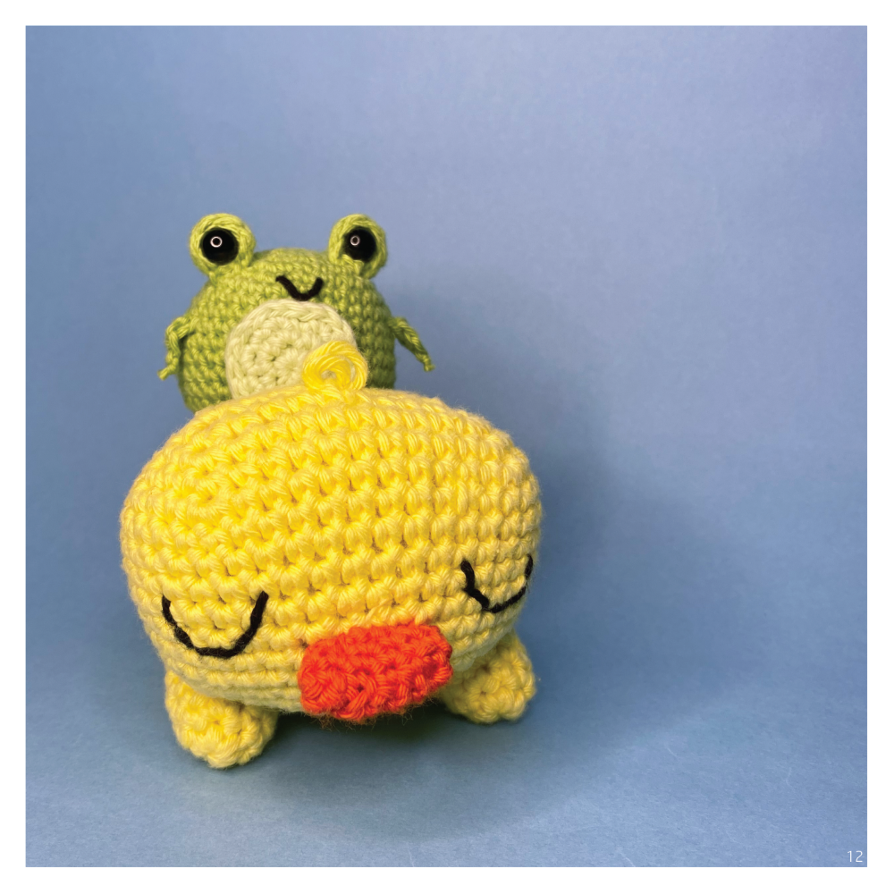
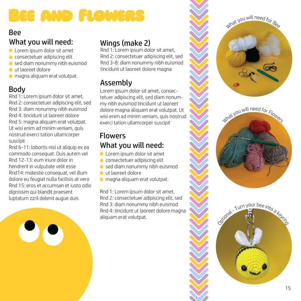
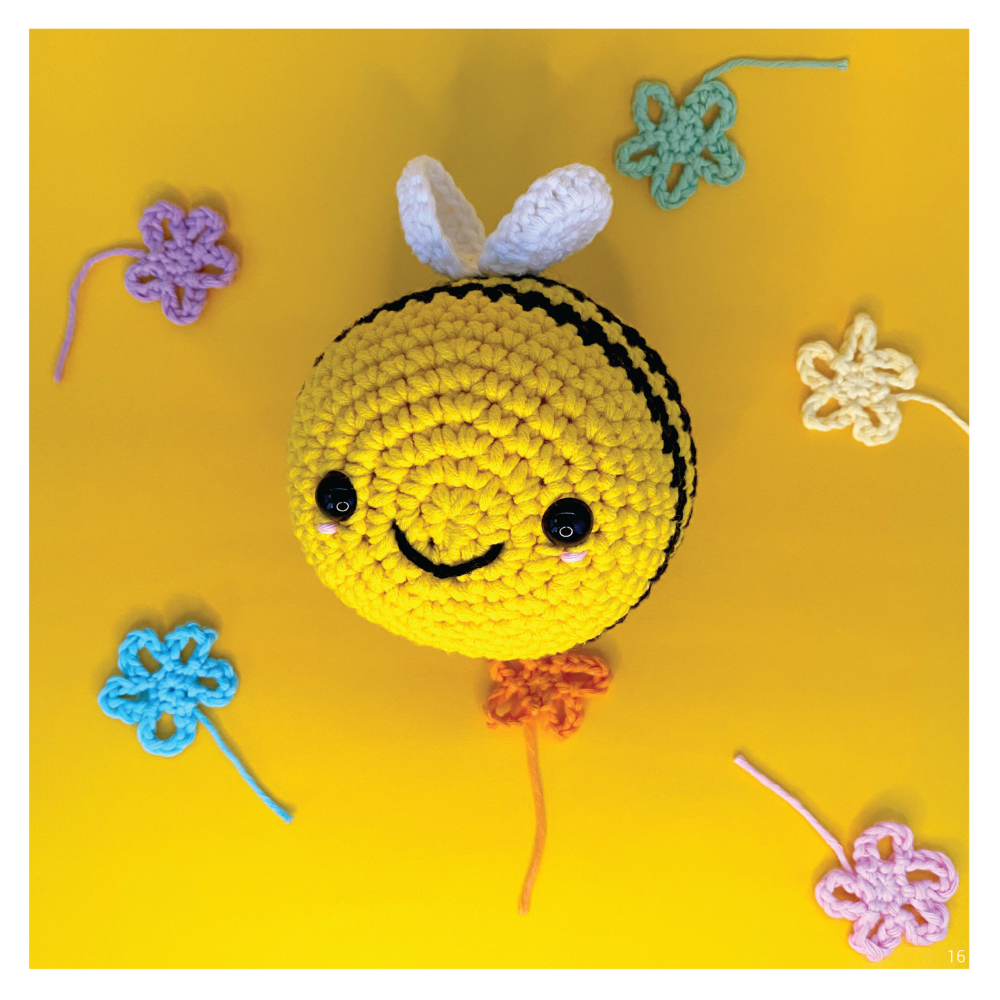
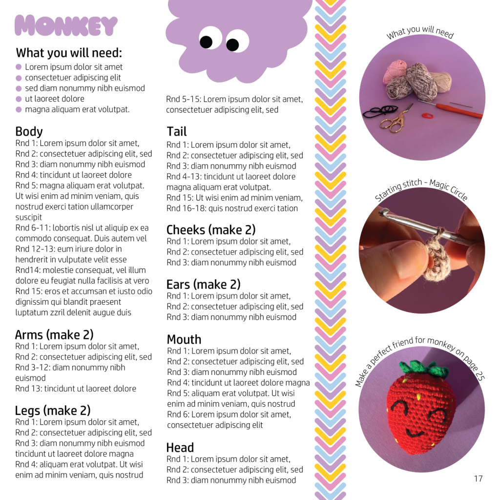
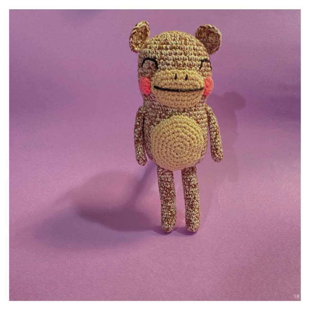
On each two-page spread I envisioned the right page being an image of the final product that the pattern is teaching, this will allow the reader to easily locate the pattern they are searching for as well as knowing what their final work should look like. On the left page I chose for a three-column approach, the first two columns being the crochet pattern and the third having circular images with text wrapping around them explaining the contents of the image. I choose to have circular images because of the rounded/soft edge nature of the branding for ‘Hooked on Learning’, in addition when looking at the top of a ball of yarn they are circular. Between each heading, paragraph, and column there is a 5mm gap ensuring that the layout is clear. The use of the illustrations allowed for the composition to be stimulating whilst also flowing nicely for the learning crocheters.
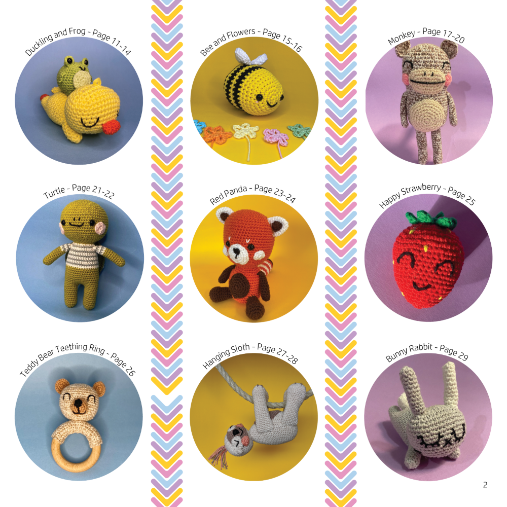
Once I had created three sets of two-page spreads that followed the layout of the master compositional grid, I had the idea of creating a contents page that didn’t completely match the master compositional grid layout but still corresponded with it. Rather than designing a traditional contents page with no imagery, I thought it would be easier for the target audience and more interesting if they could find the page based on an image of a crocheted soft toy, therefore included the circular images with the wrap around text. I kept the structure of three circular images per column with the crochet stitch illustration as a divider. However, on the left page thought it would be appropriate to include the company logo with a small paragraph about the book and then move straight onto the images of what would be included.
References
Whilst I crocheted the contents of the imagery the patterns were written as follows (patterns not mentioned were developed by myself):
Bee – Hooked by Robin
Duckling, Monkey, Bunny – Kristina Turner of Tiny Curl
Sloth – essiebirdies
Turtle – Yan Schenkel